Better Data Visualizations
September 2 + 9, 2026
Agenda 9/2/26
- NSSD
- grammar of graphics
- ggplot
Before Wednesday, read: Tufte. 1997. Visual and Statistical Thinking: Displays of Evidence for Making Decisions. (Use Google to find it.)
NSSD:
What was Hilary trying to answer in her data collection?
Name two of Hilary’s main hurdles in gathering accurate data.
Which is better: high touch (manual) or low touch (automatic) data collection? Why?
What additional covariates are needed / desired? Any problems with them?
How much data does she need?
Are there any ethical considerations to think about?
Data Visualization
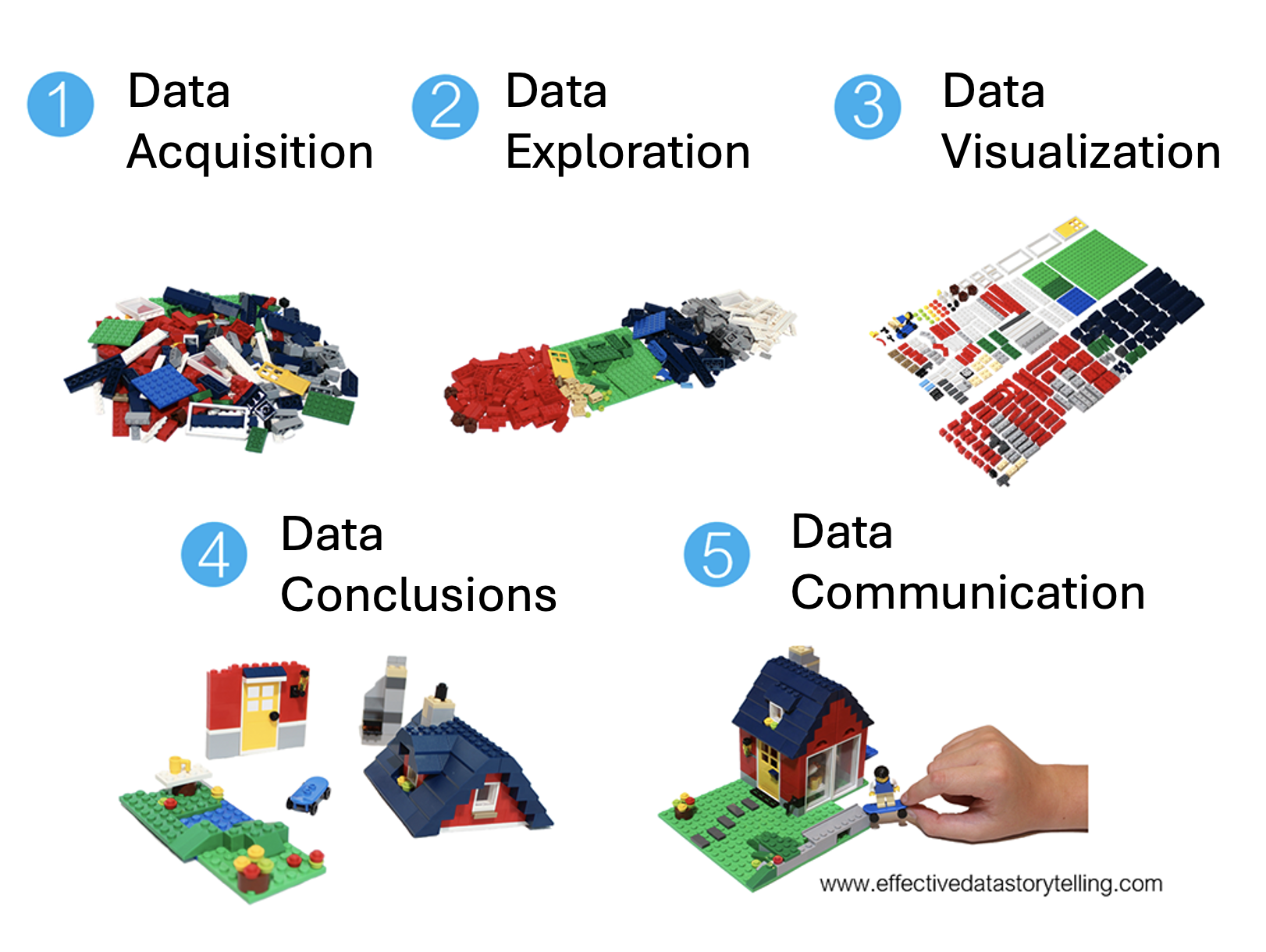
Graphics
Grammar of graphics
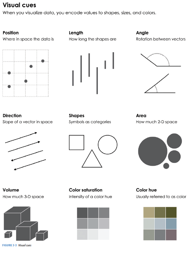
Yau (2013) gives us nine visual cues, and Wickham (2014) translates them into a language using ggplot2.
Visual Cues: the aspects of the figure where we should focus.
Position (numerical) where in relation to other things?
Length (numerical) how big (in one dimension)?
Angle (numerical) how wide? parallel to something else?
Direction (numerical) at what slope? In a time series, going up or down?
Shape (categorical) belonging to what group?
Area (numerical) how big (in two dimensions)? Beware of improper scaling!
Volume (numerical) how big (in three dimensions)? Beware of improper scaling!
Shade (either) to what extent? how severely?
Color (either) to what extent? how severely? Beware of red/green color blindness. Use color-vision-safe palettes likeviridisorOkabe–Ito.Coordinate System: rectangular, polar, geographic, etc.
Scale: numeric (linear? logarithmic?), categorical (ordered?), time
Context: in comparison to what (think back to ideas from Tufte)
Pieces of the Graph
Visual Cues of Yau (2013):
Position (numerical)
Length (numerical)
Angle (numerical)
Direction (numerical)
Shape (categorical)
Area (numerical)
Volume (numerical)
Shade (either)
Color (either)
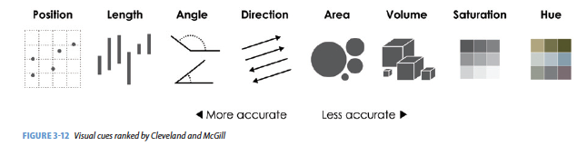
Visual Cue Matters
Cues Together
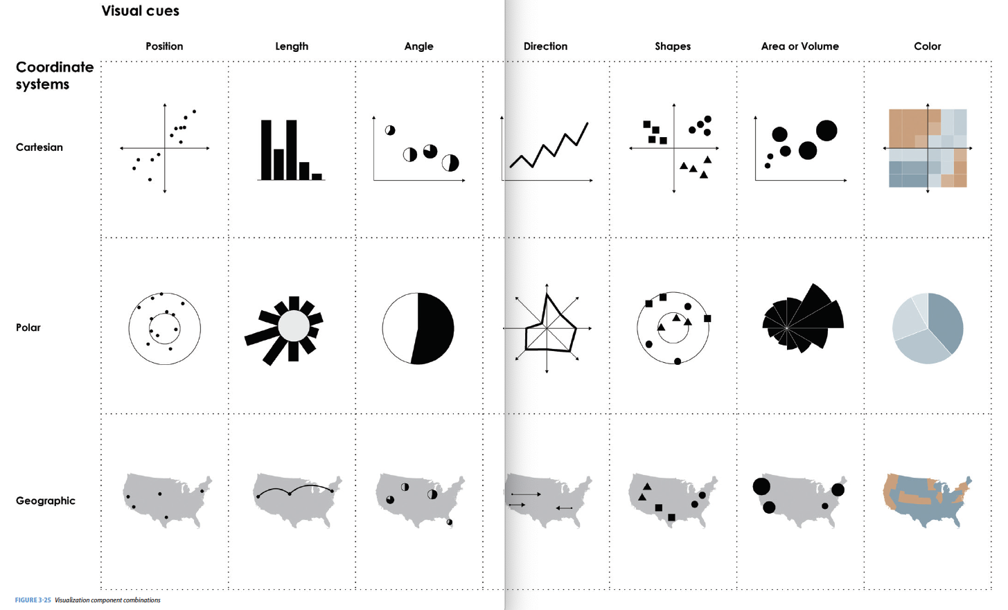
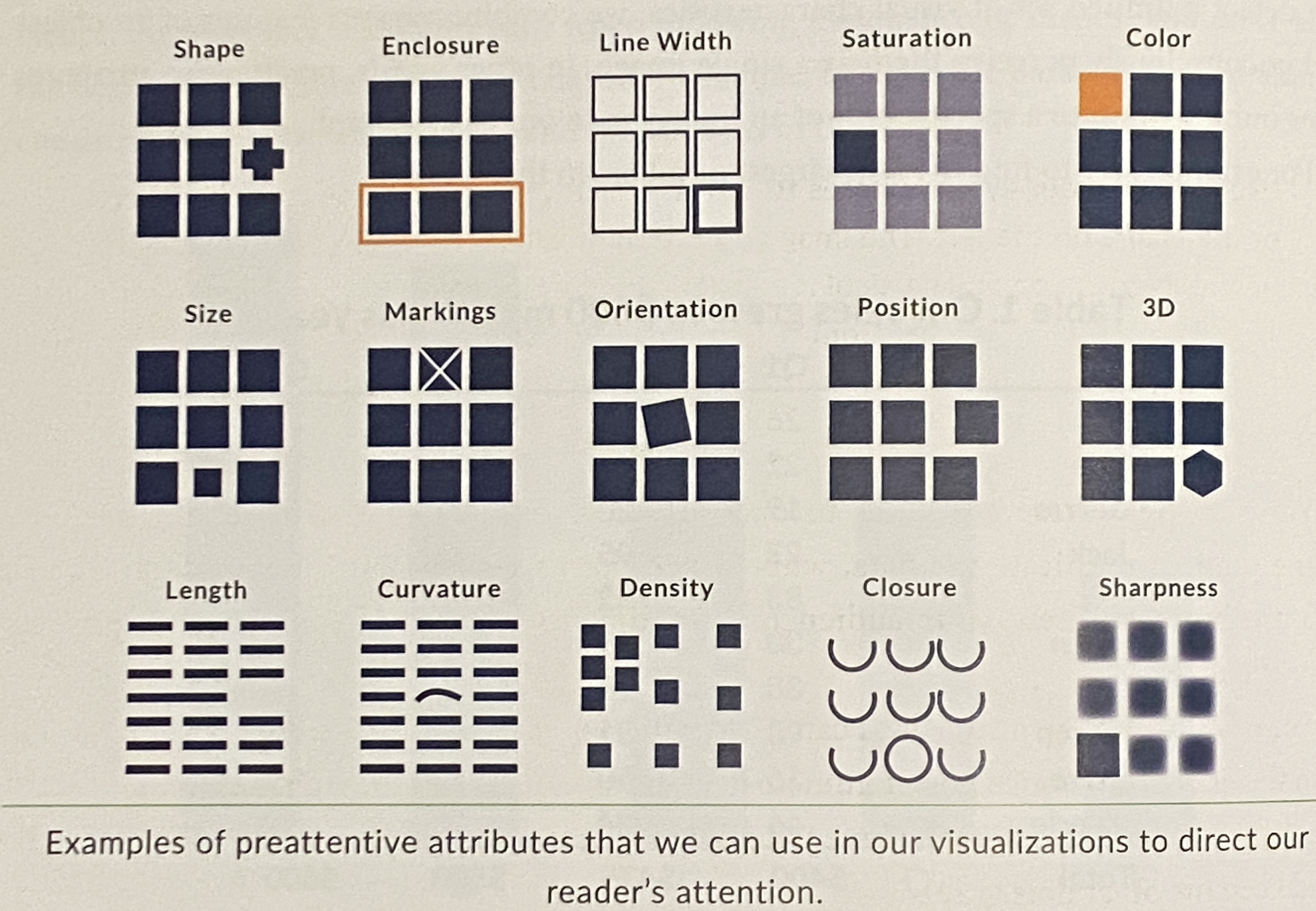
Attributes
Attributes can focus your reader’s attention.1
What are the visual cues on this plot?
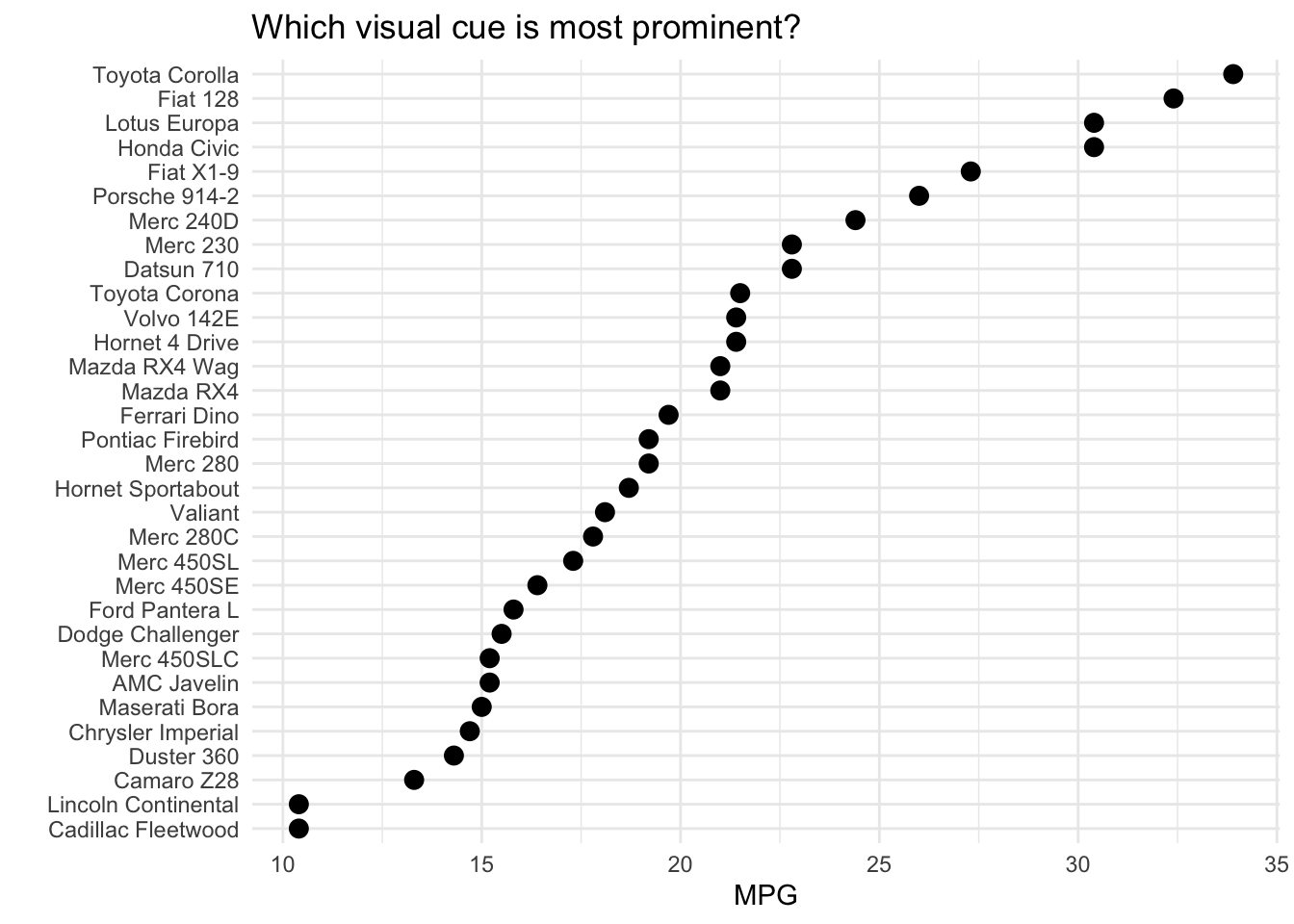
Visual cues2
What are the visual cues on this plot?
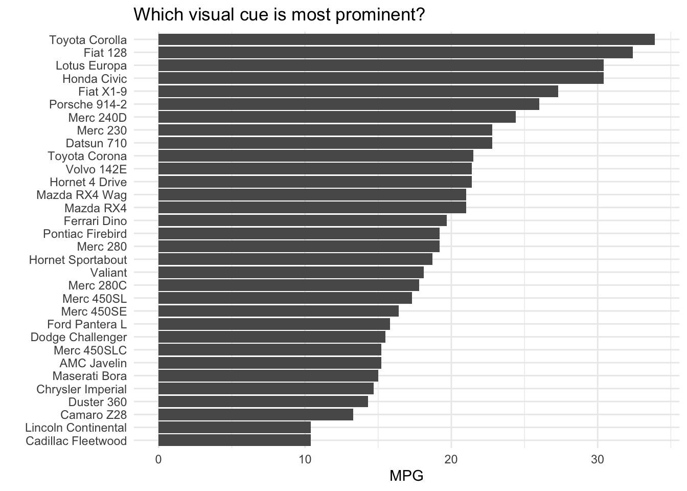
Visual cues3
What are the visual cues on this plot?
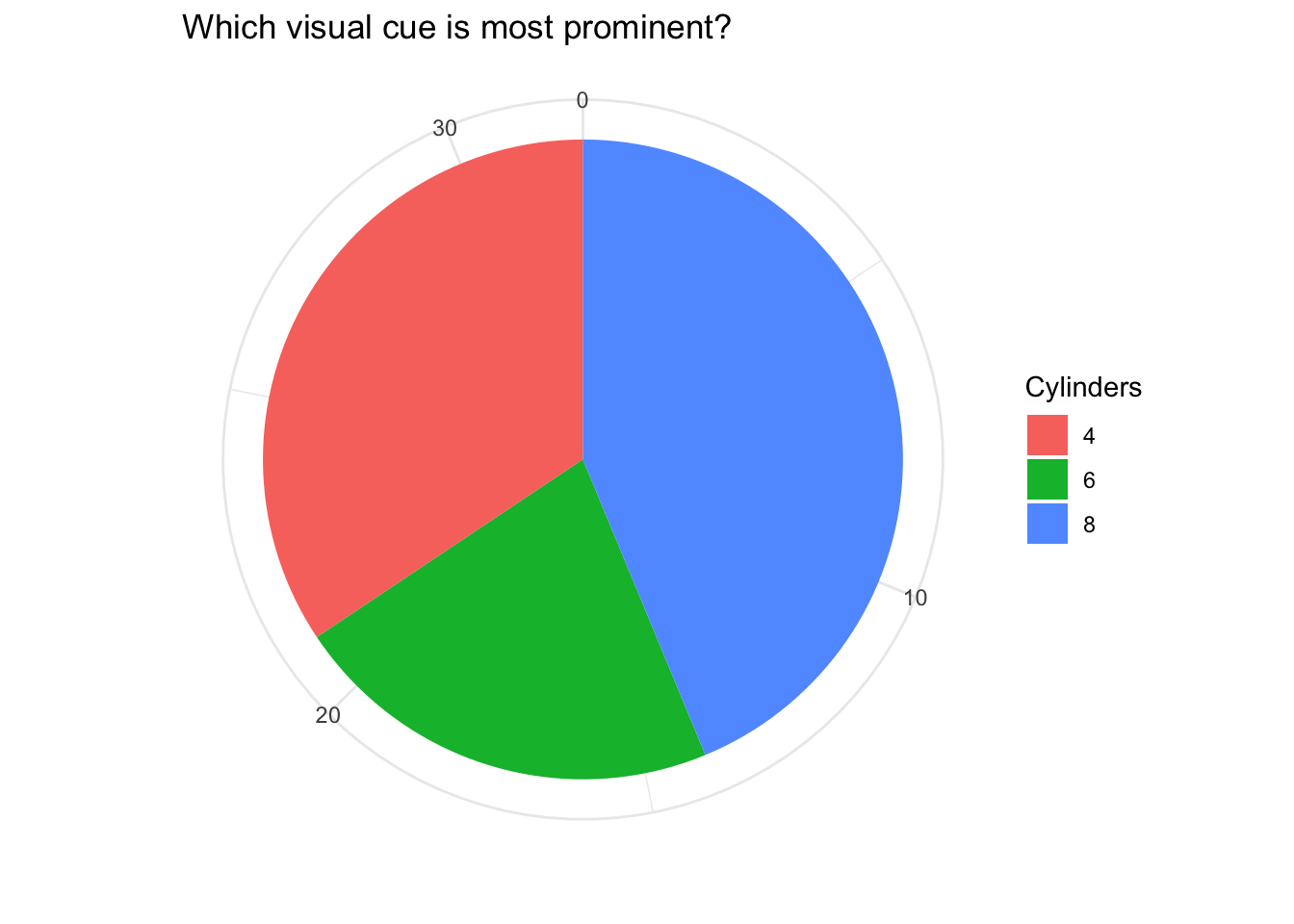
Visual cues4
What are the visual cues on this plot?
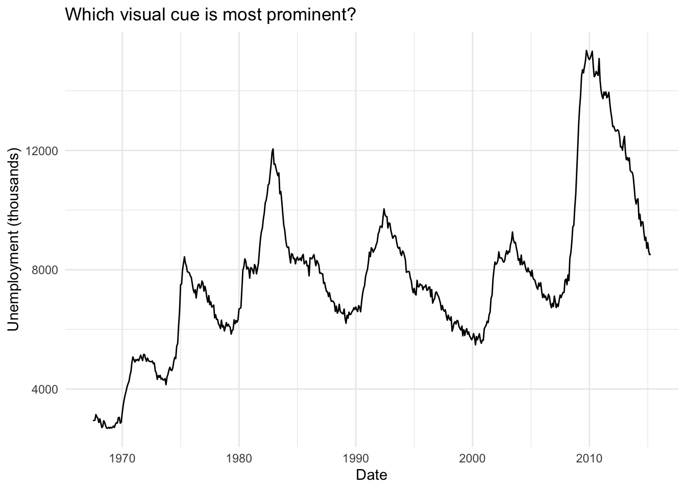
Visual cues5
What are the visual cues on this plot?
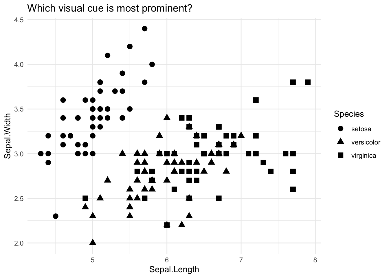
Visual cues6
What are the visual cues on this plot?
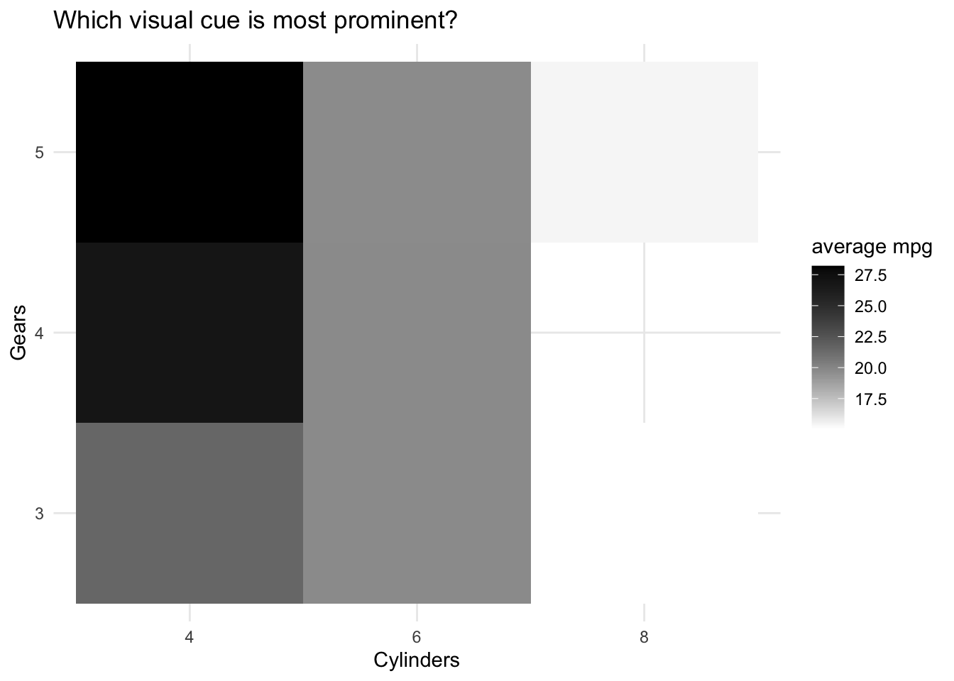
Visual cues7
What are the visual cues on this plot?
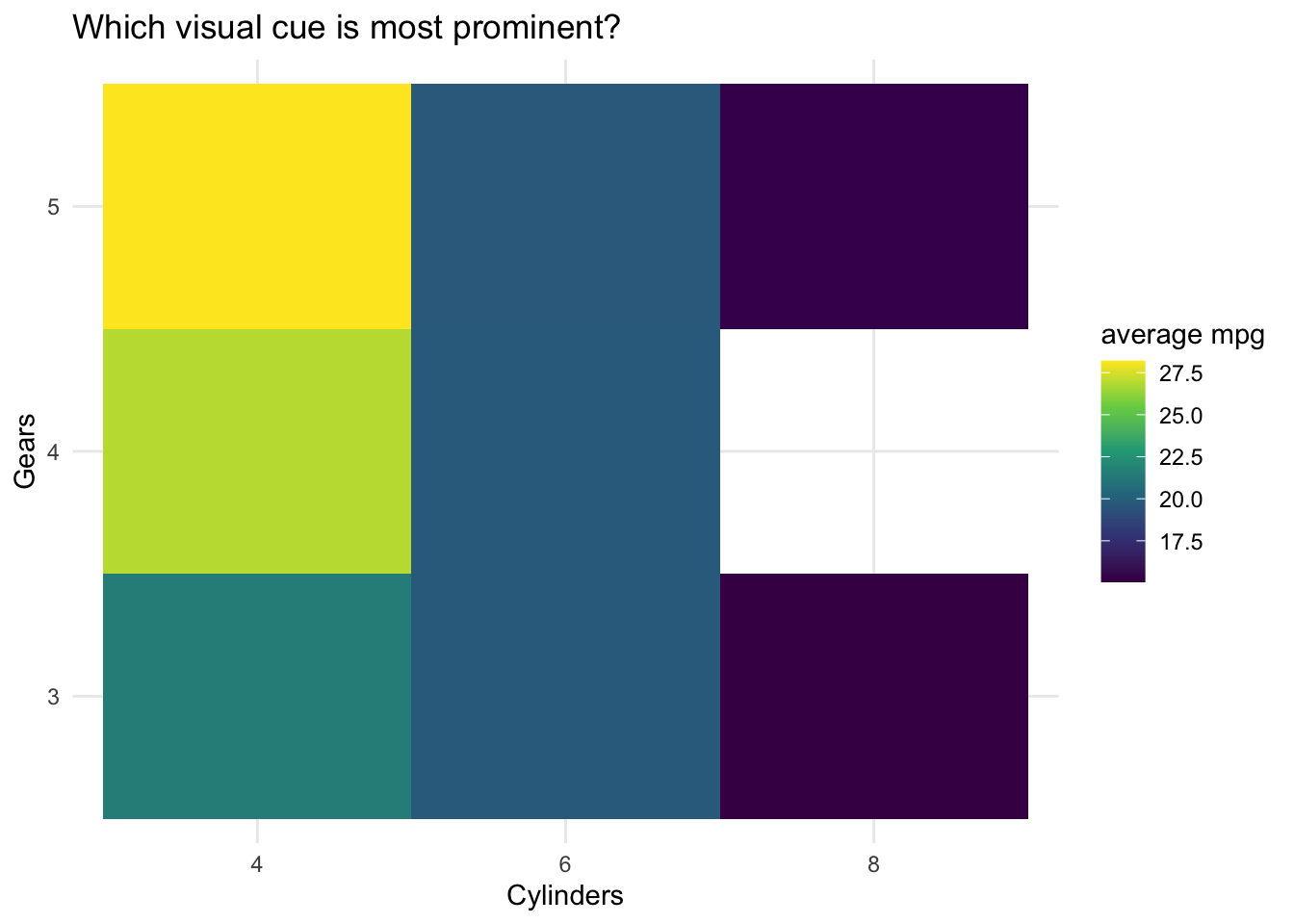
Visual cues8
Goals of **ggplot2(())
What I will try to do
give a tour of ggplot2
explain how to think about plots the ggplot2 way
prepare/encourage you to learn more later
What I can’t do in one session
show every bell and whistle
make you an expert at using ggplot2
Getting help
One of the best ways to get started with ggplot is to Google what you want to do with the word
ggplot. Then look through the images that come up.Look at the end of this presentation and the syllabus. More help options there.
The grammar of graphics ggplot
geom: the geometric “shape” used to display data
- bar, point, line, ribbon, text, etc.
aesthetic: an attribute controlling how geom is displayed with respect to variables
- x position, y position, color, fill, shape, size, etc.
guide: helps user convert visual data back into raw data (legends, axes)
stat: a transformation applied to data before geom gets it
- example: histograms work on binned data
Set up
library(mosaic)
data(Births2015)head(Births2015)| date | births | wday | year | month | day_of_year | day_of_month | day_of_week |
|---|---|---|---|---|---|---|---|
| 2015-01-01 | 8068 | Thu | 2015 | 1 | 1 | 1 | 5 |
| 2015-01-02 | 10850 | Fri | 2015 | 1 | 2 | 2 | 6 |
| 2015-01-03 | 8328 | Sat | 2015 | 1 | 3 | 3 | 7 |
| 2015-01-04 | 7065 | Sun | 2015 | 1 | 4 | 4 | 1 |
| 2015-01-05 | 11892 | Mon | 2015 | 1 | 5 | 5 | 2 |
| 2015-01-06 | 12425 | Tue | 2015 | 1 | 6 | 6 | 3 |
Obtained from the National Center for Health Statistics, National Vital Statistics System, Natality, 2015 data.
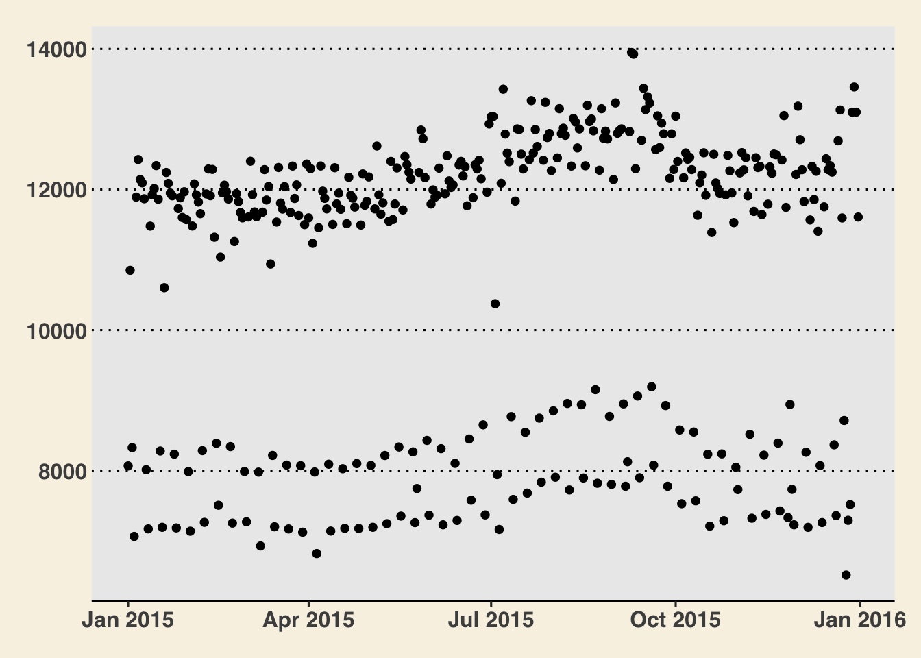
How do we make this plot?
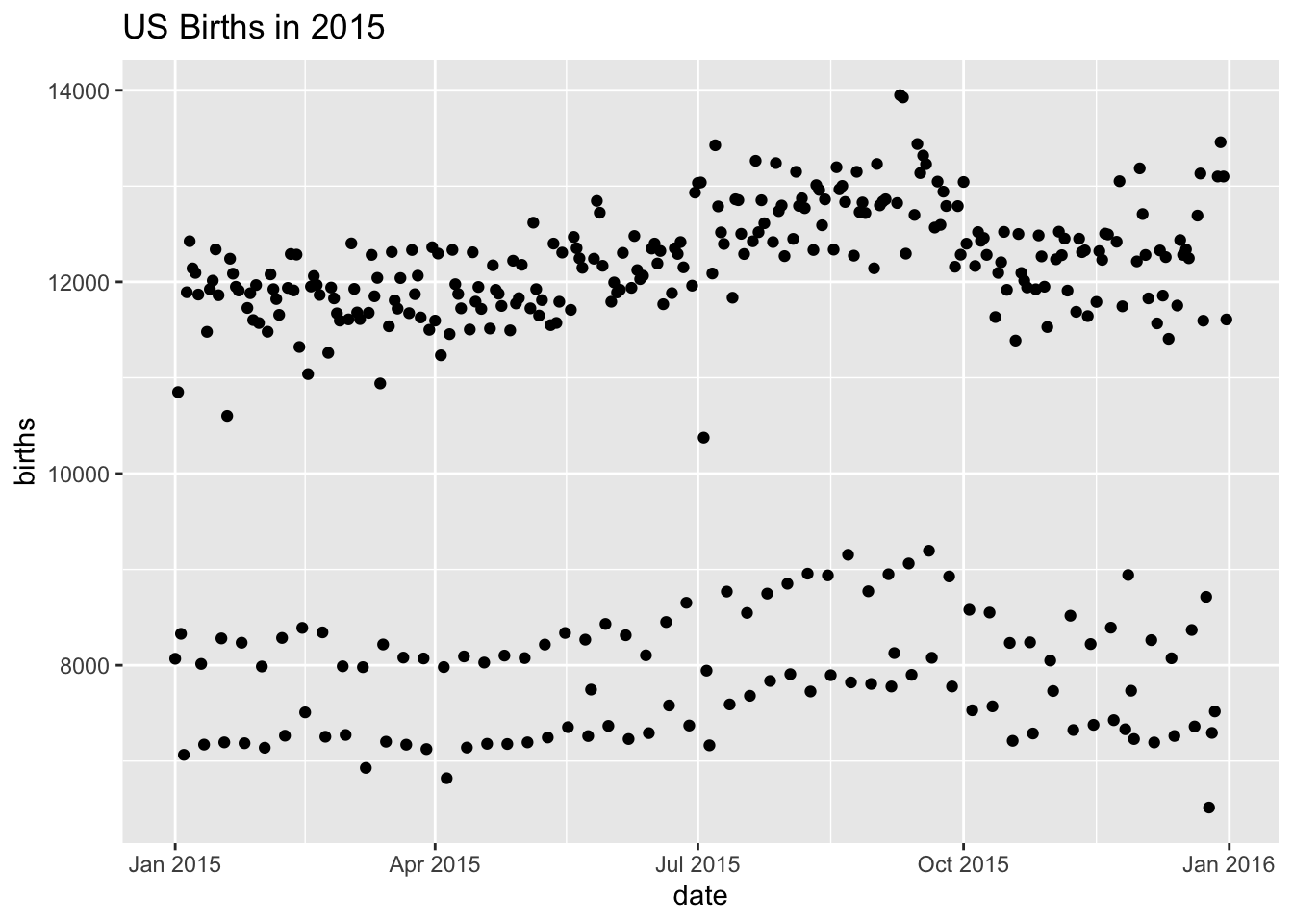
Two Questions:
What do we want R to do? (What is the goal?)
What does R need to know?
How do we make this plot?
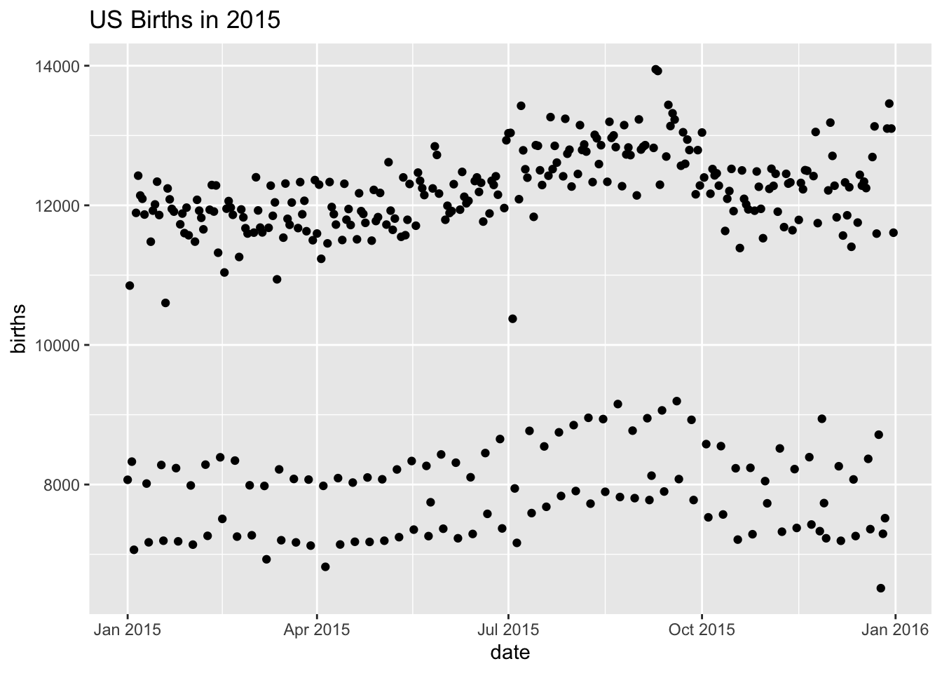
Goal: scatterplot = a plot with points
What does R need to know?
data source:
Births2015aesthetics:
date -> xbirths -> y
points
How do we make this plot?
Layers: layer 0

Layers: layer 1
Layers: layer 2
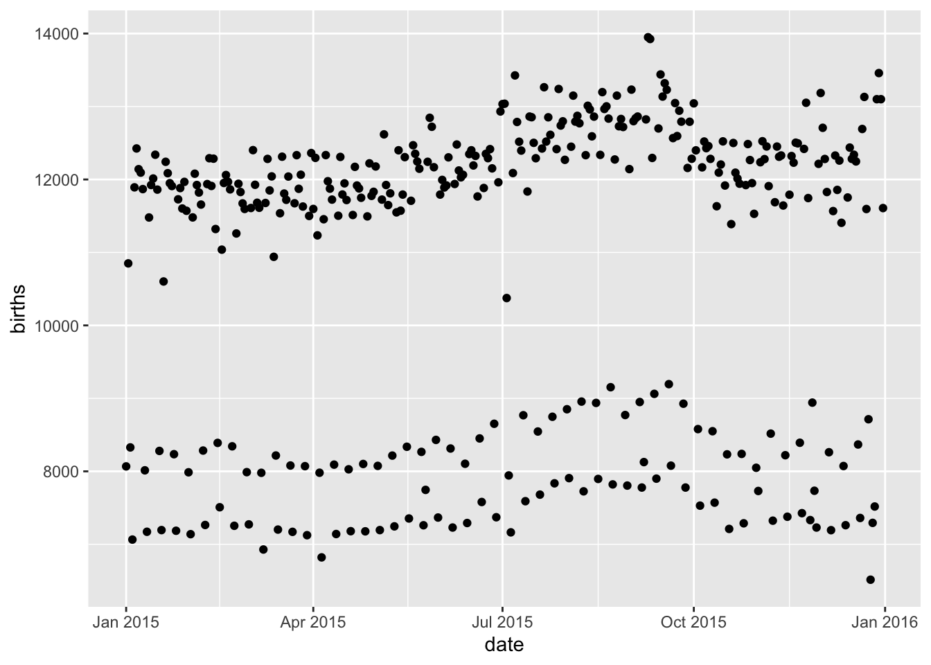
Layers: layer 3
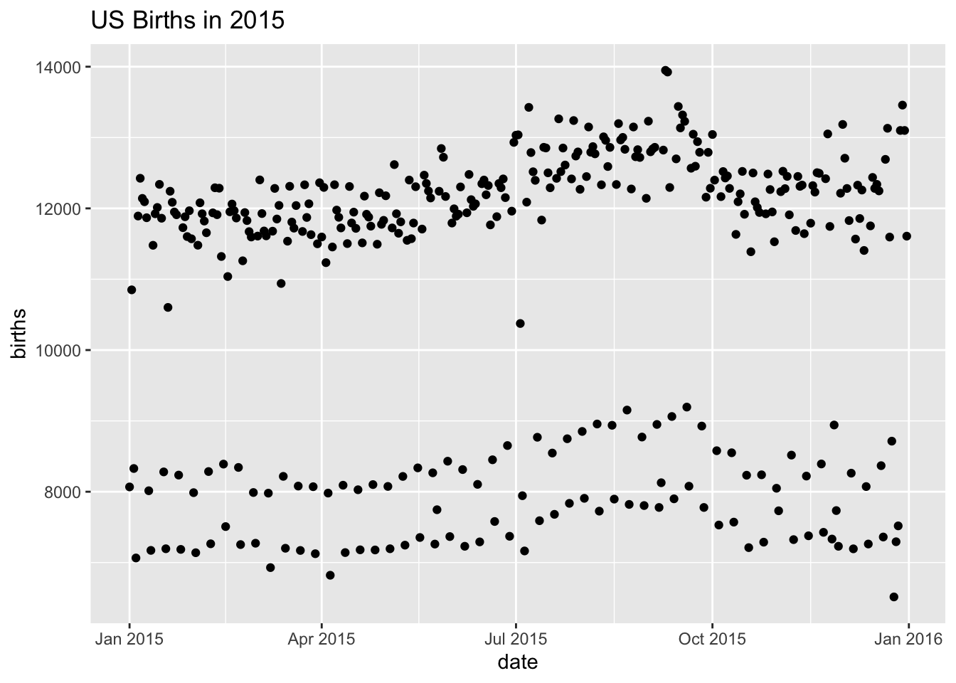
How do we make this plot?
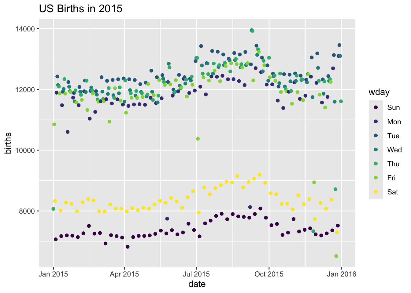
What has changed?
- new aesthetic: mapping color to day of week
How do we make this plot?
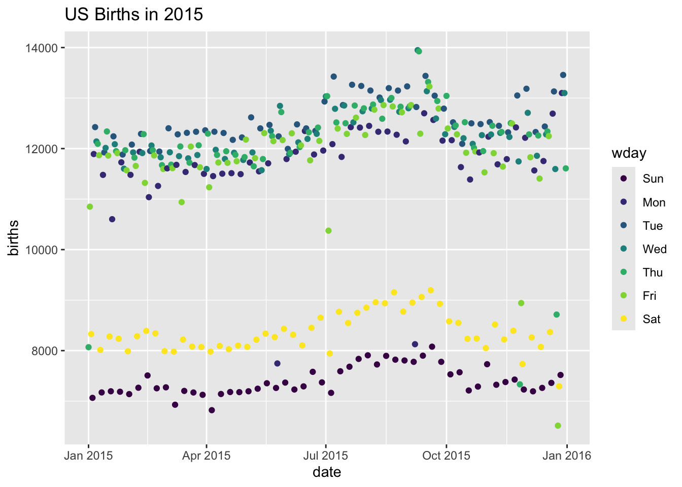
How do we make this plot?
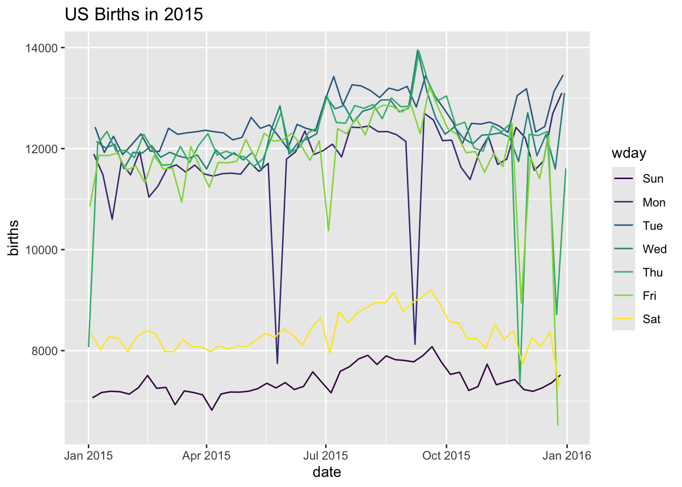
How do we make this plot?
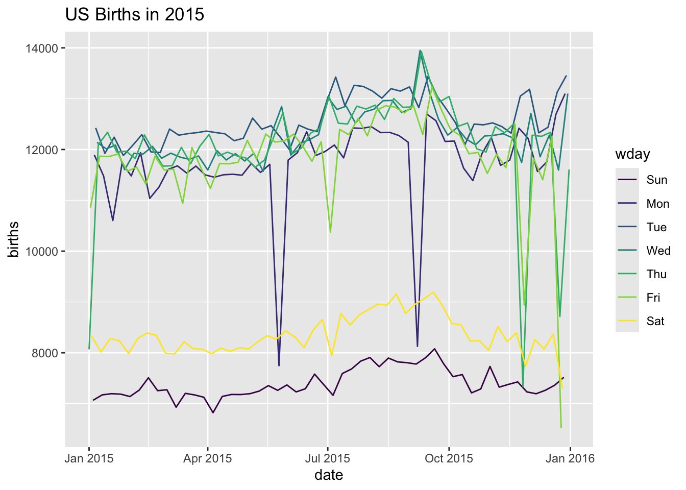
How do we make this plot?
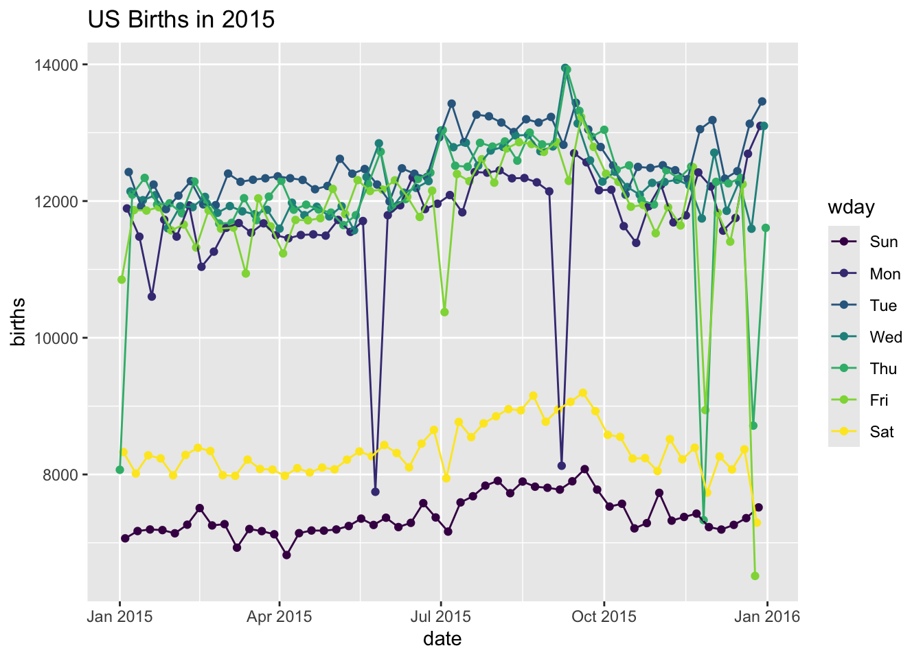
How do we make this plot?
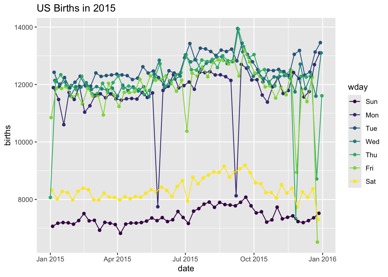
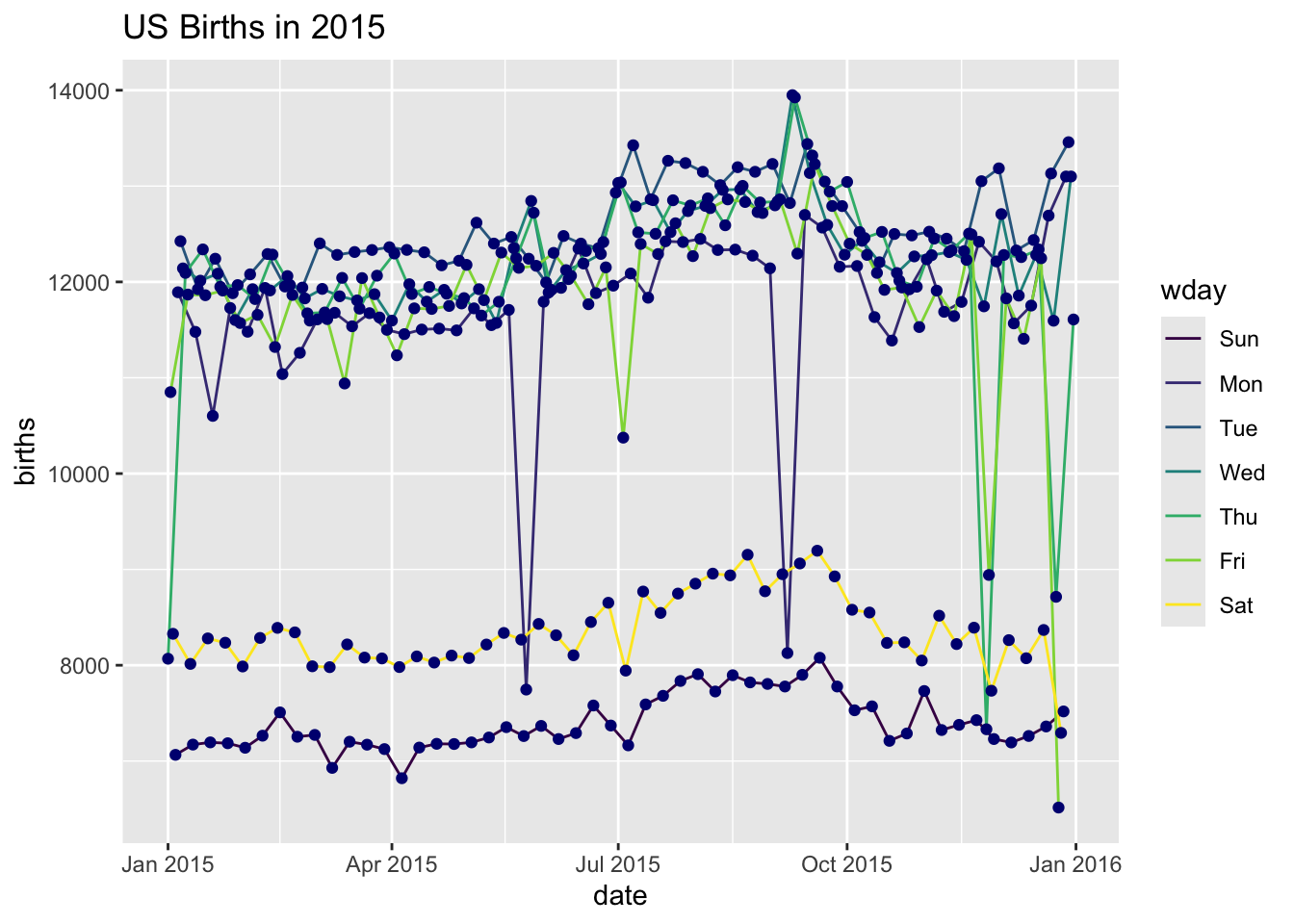
Now there are two layers: one with points and one with lines
The layers are placed one on top of the other: the points are below and the lines are above.
dataandaesspecified inggplot()affect all geoms
What does this code do?
What does this code do?
ggplot(data = Births2015, aes(x = date, y = births, color = "navy")) +
  geom_point() +
  labs(title = "US Births in 2015")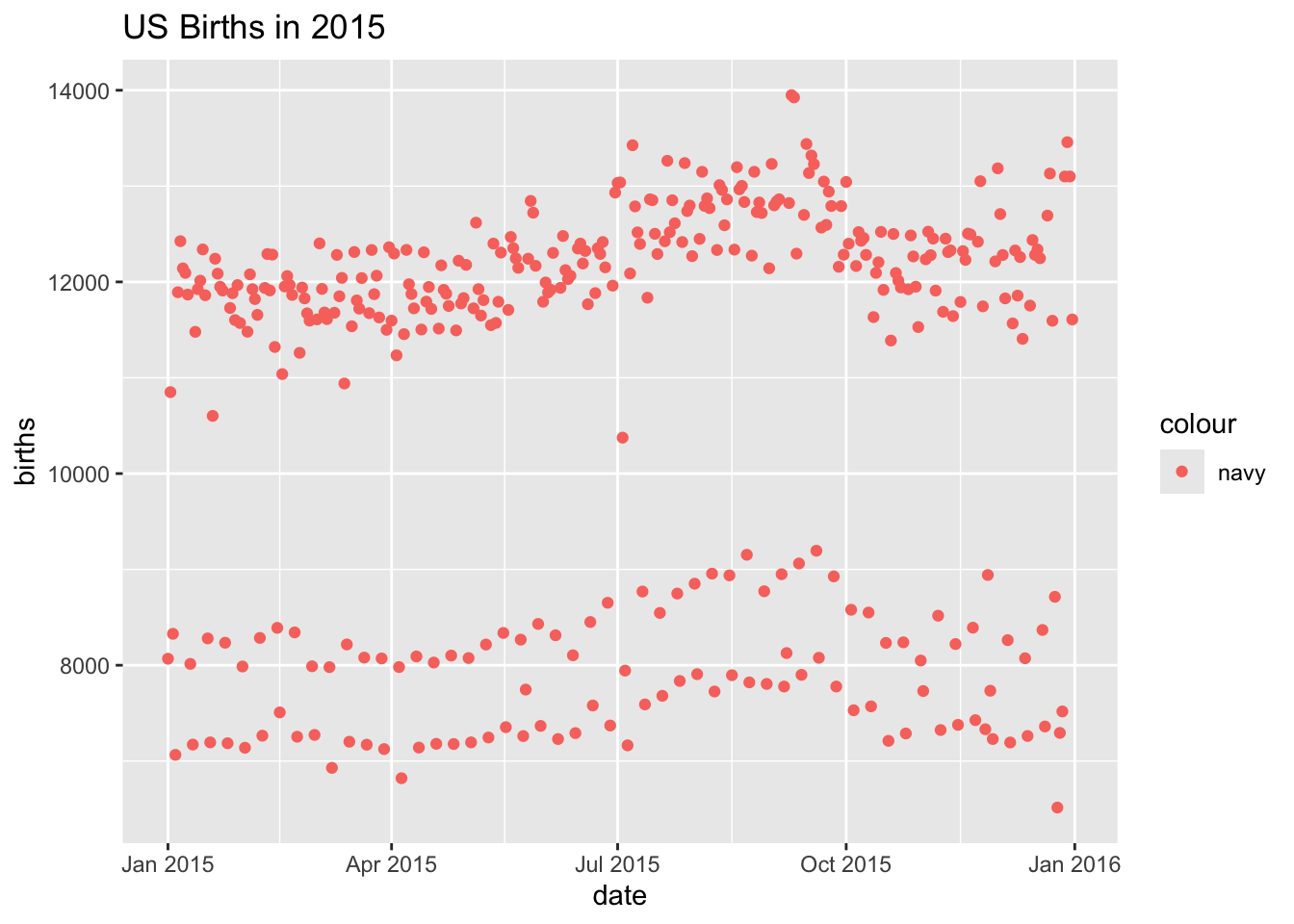
This is mapping the color aesthetic to a new variable with only one value (“navy”).
So all the dots get set to the same color, but it’s not navy.
Setting vs. Mapping
If we want to set the color to be navy for all of the dots, we do it outside the aes() designation:
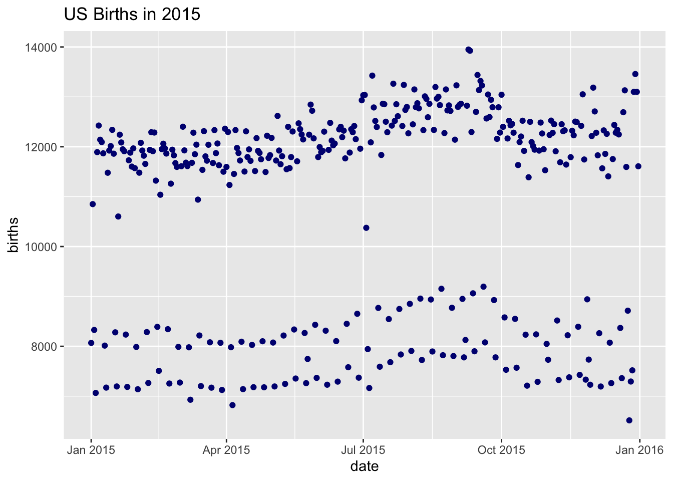
- Note that
color = "navy"is now outside of the aesthetics list. That’s how ggplot2 distinguishes between mapping and setting.
How do we make this plot?
How do we make this plot?
ggplot()establishes the default data and aesthetics for the geoms, but each geom may change the defaults.good practice: put into
ggplot()the things that affect all (or most) of the layers; rest ingeom_XXXX()
Setting vs. Mapping (again)
Information gets passed to the plot via:
mapthe variable information inside the aes (aesthetic) commandsetthe non-variable information outside the aes (aesthetic) command
Agenda 9/9/26
- advice on plotting
- Tufte
- more ggplot
Advice for Plotting
- Basic plotting
- Avoid having other graph elements interfere with data
- Use visually prominent symbols
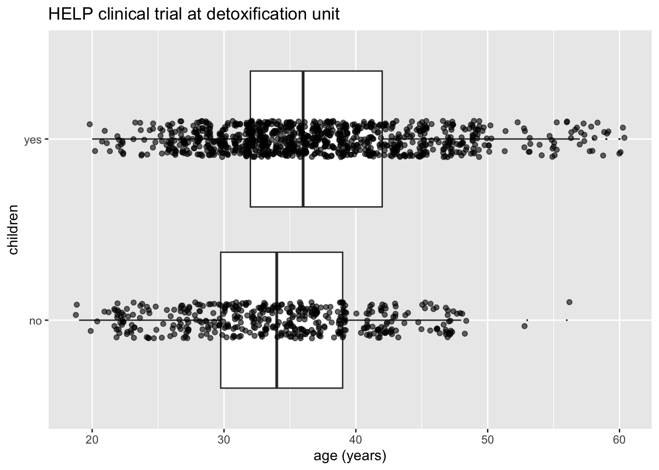
- Avoid over-plotting (One way to avoid over-plotting: jitter the values)
- Different values of data may obscure each other
- Include all or nearly all of the data
- Fill data region
Advice for Plotting
- Basic plotting
- Eliminate superfluous material
- Chart junk & stuff that adds no meaning, e.g., butterflies on top of barplots, background images
- Extra tick marks and grid lines
- Unnecessary text and arrows
- Decimal places beyond the measurement error or the level of difference
Advice for Plotting
- Basic plotting
- Eliminate superfluous material
- Facilitate comparisons
- Put juxtaposed plots on same scale
- Make it easy to distinguish elements (e.g., color)
- Emphasize the important difference
- Comparison: volume, area, height (be careful, volume can seem bigger than you mean it to)
Advice for Plotting
- Basic plotting
- Eliminate superfluous material
- Facilitate comparisons
- Choosing the scale
- Keep scales on x and y axes the same for both plots to facilitate the comparison
- Zoom in to focus on the region that contains the bulk of the data
- Keep the scale the same throughout the plot (i.e., don’t change it mid-axis)
- Origin need not be on the scale
- Choose a scale that improves resolution
- Avoid jiggling the baseline
Advice for Plotting
- Basic plotting
- Eliminate superfluous material
- Facilitate comparisons
- Choosing the scale
- How to make a plot information rich
- Describe what you see in the caption
- Add context with reference markers (lines and points) including text
- Add legends and labels
- Use color and plotting symbols to add more information
- Plot the same thing more than once in different ways/scales
- Reduce clutter
Advice for Plotting
- Basic plotting
- Eliminate superfluous material
- Facilitate comparisons
- Choosing the scale
- How to make a plot information rich
- Captions should
- Be comprehensive
- Self-contained
- Describe what has been graphed
- Draw attention to important features
- Describe conclusions drawn from graph
Advice for Plotting
- Basic plotting
- Eliminate superfluous material
- Facilitate comparisons
- Choosing the scale
- How to make a plot information rich
- Captions should
- Good Plot Making Practice
- Put major conclusions in graphical form
- Provide reference information
- Proofread for clarity and consistency
- Graphing is an iterative process
- Multiplicity is OK, i.e., two plots of the same variable may provide different messages
- Make plots data rich
Preliminaries
Make the data stand out
Facilitate comparison
Add information
(Nolan & Perrrett, 2016)
Preliminaries
Tufte lists two main motivational steps to working with graphics as part of an argument.
“An essential analytic task in making decisions based on evidence is to understand how things work.”
“Making decisions based on evidence requires the appropriate display of that evidence.”
Advice on plotting, specific
- Avoid having other graph elements interfere with data
- Use visually prominent symbols
- Avoid over-plotting (One way to avoid over-plotting: jitter the values)
- Different values of data may obscure each other
- Include all or nearly all of the data
- Fill data region
Advice on plotting, general
- Eliminate superfluous material
- Facilitate comparisons
- Choose the best scale
- Make the plot data / information rich
- Use good captions, alt text, conclusions
- Make your website accessible, how to add alt text. Feel free to use (and then check!!!) the
autoAltpackage in R which automatically generates alt text.
Examples in the wild
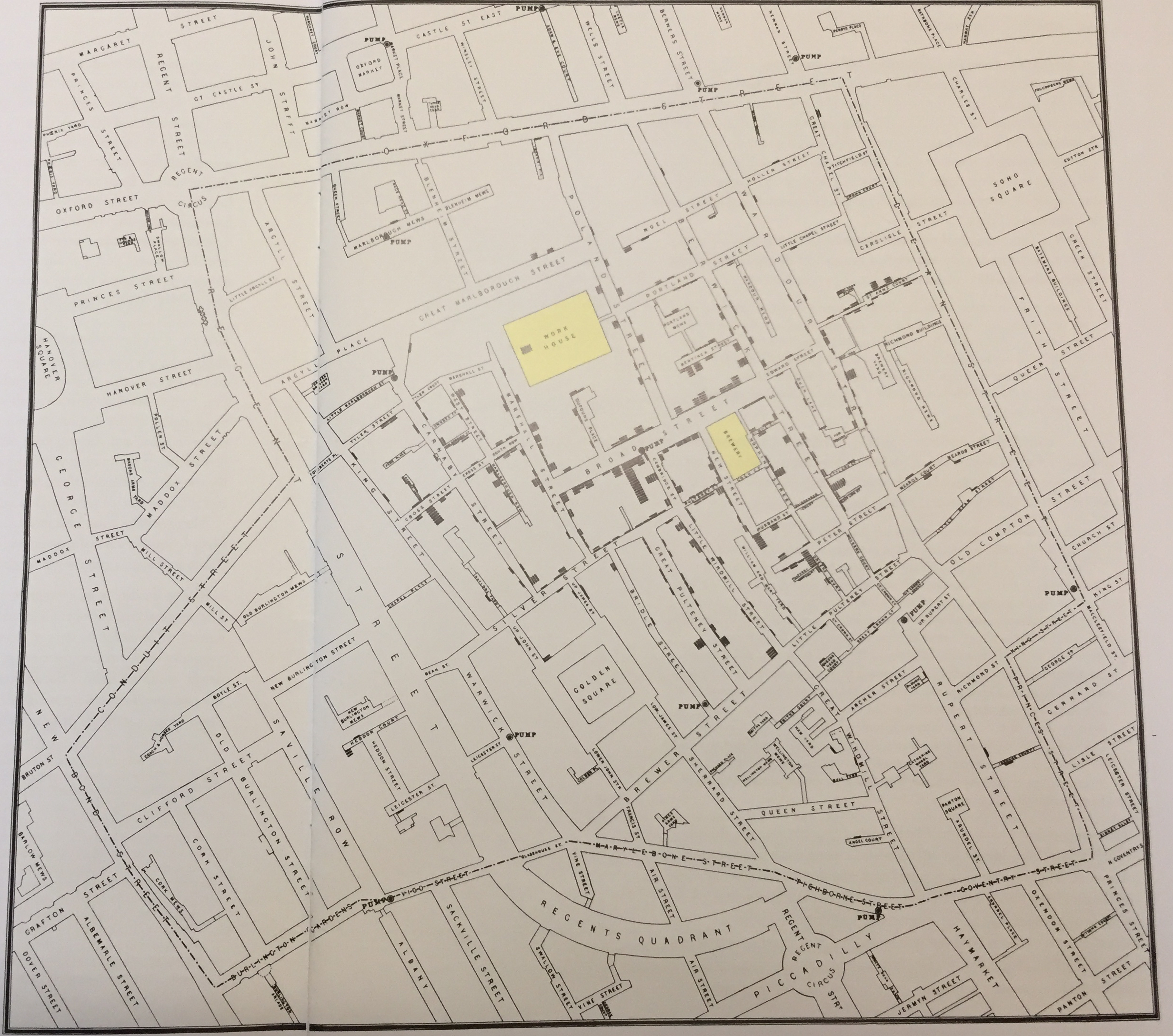
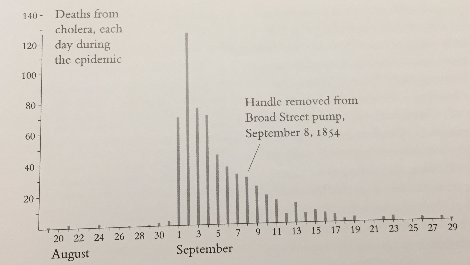
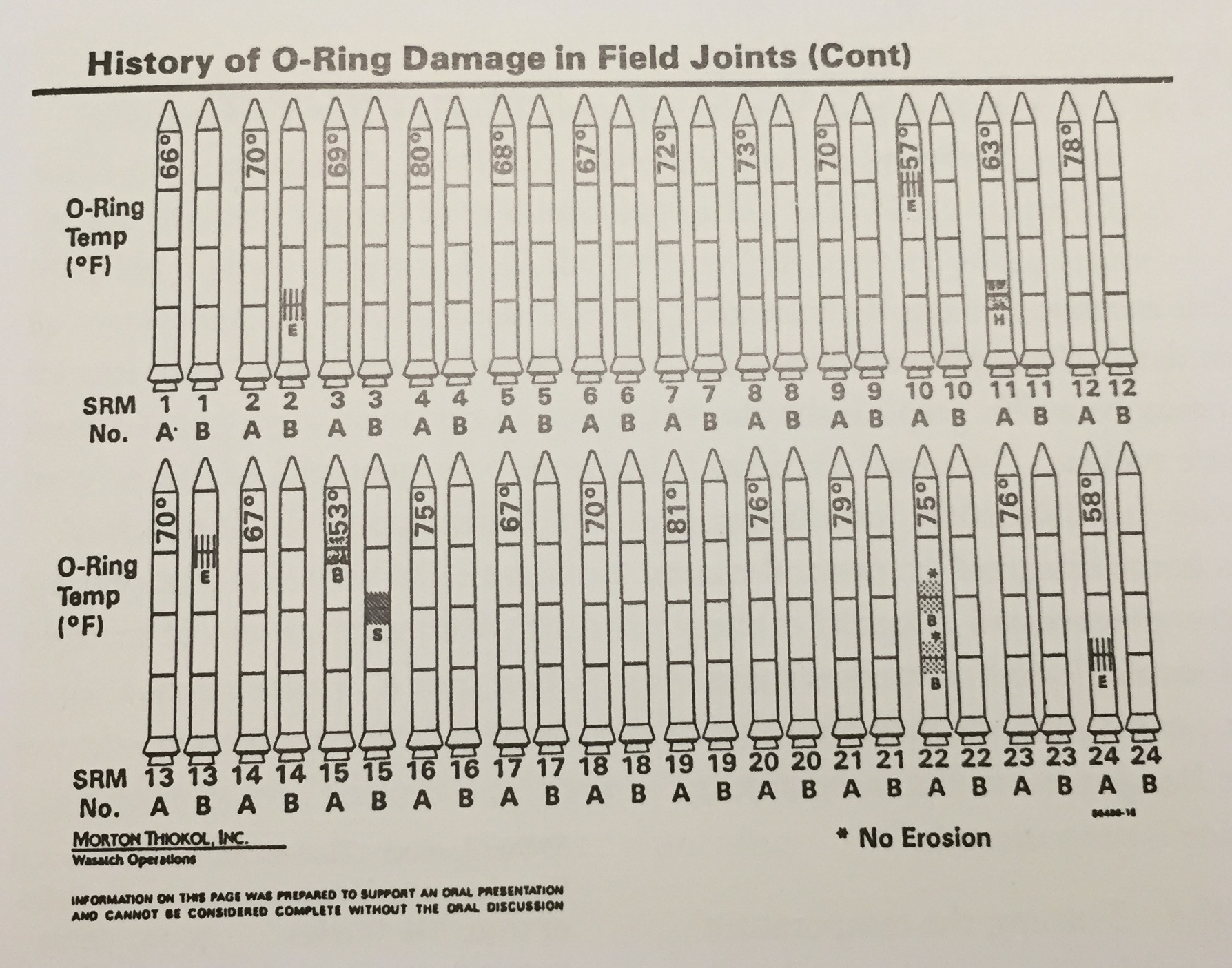
- Tufte – Cholera & Challenger
- Fonts
- NYT often does data viz quite well
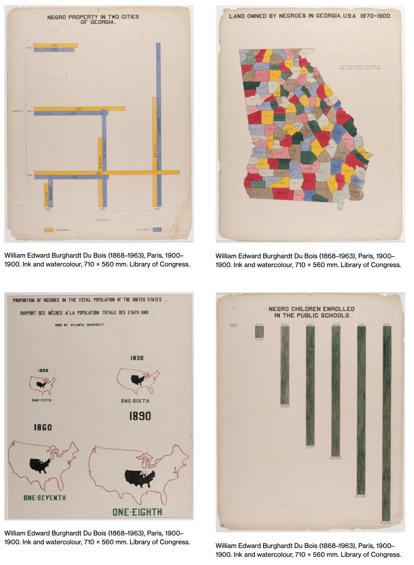
- W.E.B Du Bois
Tufte
Tufte (1997) Visual and Statistical Thinking: Displays of Evidence for Making Decisions. (Use Google to find it.)
Cholera - a picture tells 1000 words
Cholera - difficult to interpret
Challenger - Problematic
Challenger - Better????
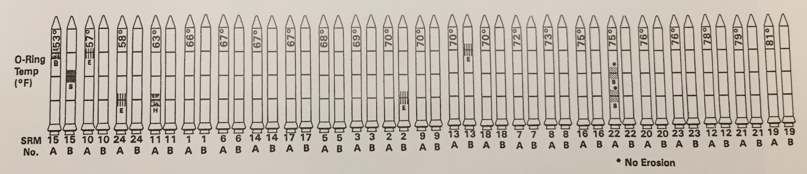
Challenger - Improved
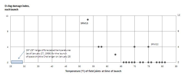
Note that the “improved” Challenger graphic was made by Tufte, not by the engineers working on the problem at the time.
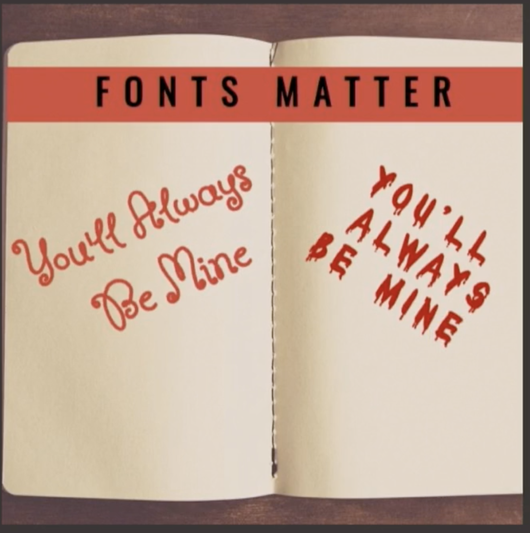
Fonts matter
Simplify
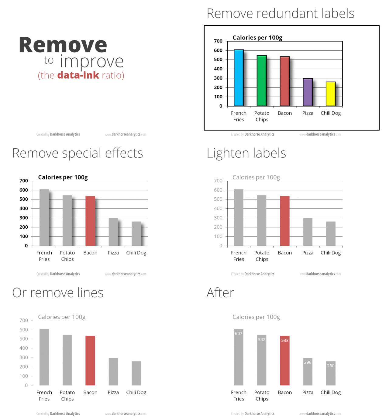
Simplified
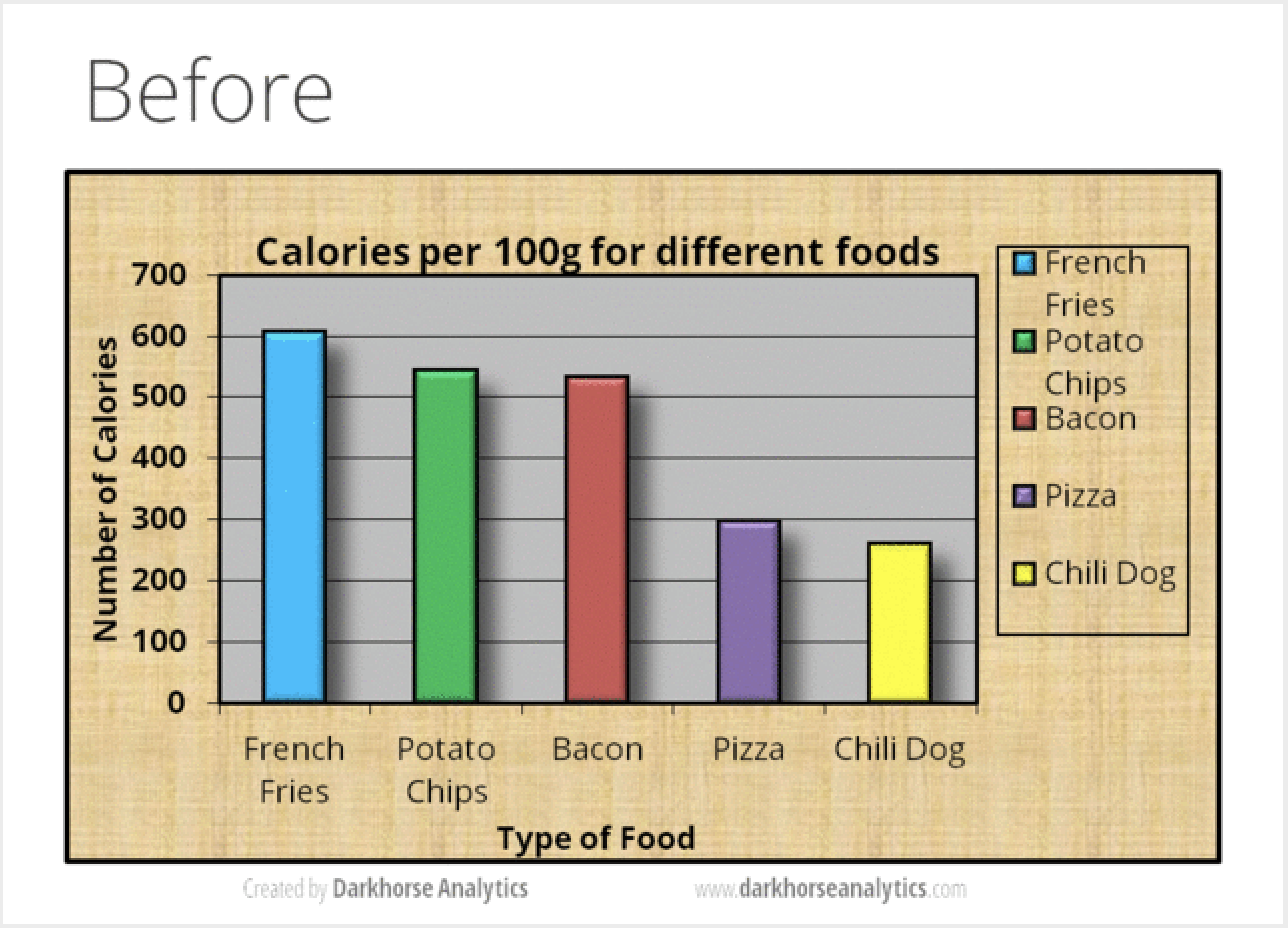
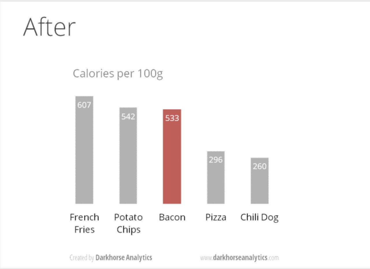
image credit: https://www.darkhorseanalytics.com/portfolio-data-looks-better-naked
NYT 9/7/21
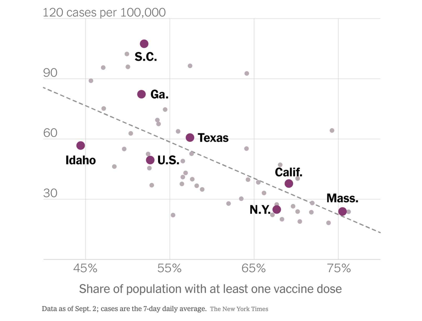
- lighter grid lines
- no extra information
- good caption
- regression line to give context to the trend
- y axes labels horizontal, not vertical
- a few states (and the US) are highlighted to draw the reader’s eye
W.E.B. Du Bois
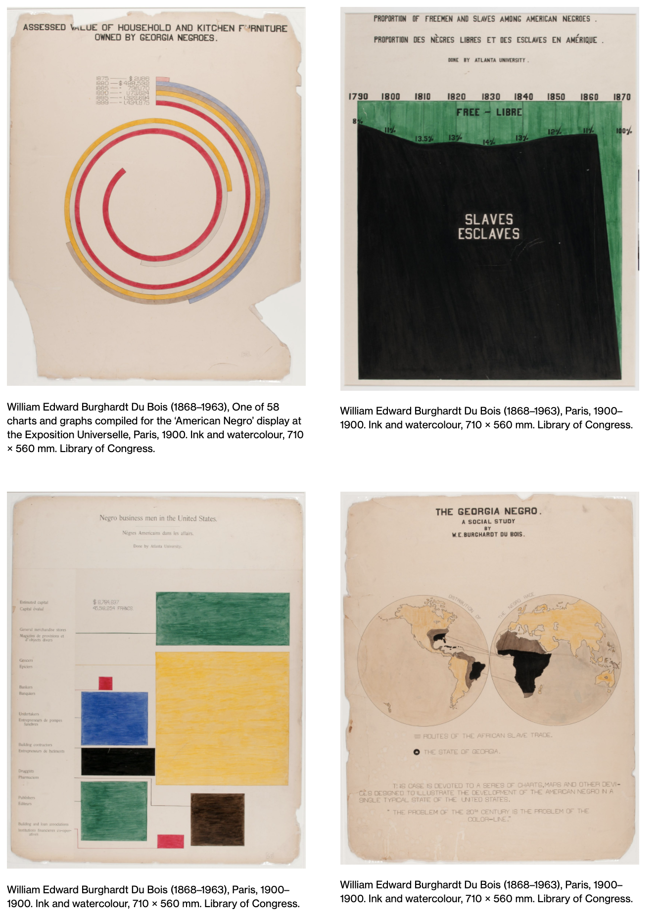
One of the great early data viz pioneers. Remarkable ability to convey information.
Worth a Mention
W.E.B. Du Bois (1868-1963)
- sociologist
- data scientist
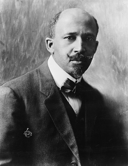
In 1900 Du Bois contributed approximately 60 data visualizations to an exhibit at the Exposition Universelle in Paris, an exhibit designed to illustrate the progress made by African Americans since the end of slavery (only 37 years prior, in 1863).
Beautiful & Informative Graphics
https://drawingmatter.org/w-e-b-du-bois-visionary-infographics/
More ggplot2
So much more to cover with ggplot2!
Other geoms
apropos("^geom_") [1] "geom_abline" "geom_area"
[3] "geom_ash" "geom_bar"
[5] "geom_bin_2d" "geom_bin2d"
[7] "geom_blank" "geom_boxplot"
[9] "geom_bracket" "geom_col"
[11] "geom_contour" "geom_contour_filled"
[13] "geom_count" "geom_crossbar"
[15] "geom_curve" "geom_density"
[17] "geom_density_2d" "geom_density_2d_filled"
[19] "geom_density_line" "geom_density_ridges"
[21] "geom_density_ridges_gradient" "geom_density_ridges2"
[23] "geom_density2d" "geom_density2d_filled"
[25] "geom_dotplot" "geom_errorbar"
[27] "geom_errorbarh" "geom_exec"
[29] "geom_freqpoly" "geom_function"
[31] "geom_hex" "geom_histogram"
[33] "geom_hline" "geom_jitter"
[35] "geom_label" "geom_label_repel"
[37] "geom_line" "geom_linerange"
[39] "geom_lm" "geom_map"
[41] "geom_marquee_repel" "geom_path"
[43] "geom_point" "geom_pointrange"
[45] "geom_polygon" "geom_pwc"
[47] "geom_qq" "geom_qq_line"
[49] "geom_quantile" "geom_rangeframe"
[51] "geom_raster" "geom_rect"
[53] "geom_ribbon" "geom_ridgeline"
[55] "geom_ridgeline_gradient" "geom_rug"
[57] "geom_segment" "geom_sf"
[59] "geom_sf_label" "geom_sf_text"
[61] "geom_signif" "geom_smooth"
[63] "geom_spline" "geom_spoke"
[65] "geom_step" "geom_stripped_cols"
[67] "geom_stripped_rows" "geom_text"
[69] "geom_text_repel" "geom_tile"
[71] "geom_tufteboxplot" "geom_violin"
[73] "geom_vline" "geom_vridgeline" Other geoms
help pages will tell you their aesthetics, default stats, etc.
?geom_area # for exampleLet’s try geom_area
ggplot(data = Births2015, aes(x = date, y = births, fill = wday)) +
  geom_area() +
  labs(title = "US Births in 2015")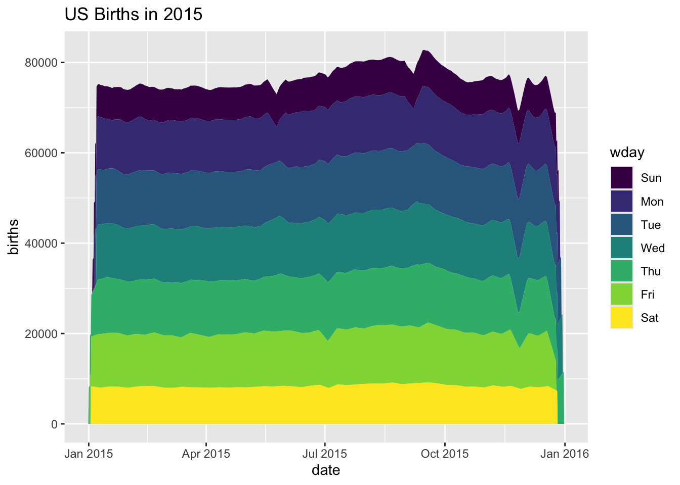
Let’s try geom_area
ggplot(data = Births2015, aes(x = date, y = births, fill = wday)) +
  geom_area() +
  labs(title = "US Births in 2015")
… not a good plot
- overplotting is hiding much of the data
- extending y-axis to 0 may or may not be desirable.
Side note: what makes a plot good?
Most (all?) graphics are intended to help us make comparisons
- How does something change over time?
- Do my treatments matter? How much?
- Do treatment and control respond the same way?
Does my plot make the comparisons I am interested in:
- easily, and
- accurately?
Time for some different data
HELPrct: Health Evaluation and Linkage to Primary care randomized clinical trial. Subjects admitted for treatment for addiction to one of three substances.
head(HELPrct)| age | anysubstatus | anysub | cesd | d1 | daysanysub | dayslink | drugrisk | e2b | female | sex | g1b | homeless | i1 | i2 | id | indtot | linkstatus | link | mcs | pcs | pss_fr | racegrp | satreat | sexrisk | substance | treat | avg_drinks | max_drinks | hospitalizations |
|---|---|---|---|---|---|---|---|---|---|---|---|---|---|---|---|---|---|---|---|---|---|---|---|---|---|---|---|---|---|
| 37 | 1 | yes | 49 | 3 | 177 | 225 | 0 | NA | 0 | male | yes | housed | 13 | 26 | 1 | 39 | 1 | yes | 25.11 | 58.4 | 0 | black | no | 4 | cocaine | yes | 13 | 26 | 3 |
| 37 | 1 | yes | 30 | 22 | 2 | NA | 0 | NA | 0 | male | yes | homeless | 56 | 62 | 2 | 43 | NA | NA | 26.67 | 36.0 | 1 | white | no | 7 | alcohol | yes | 56 | 62 | 22 |
| 26 | 1 | yes | 39 | 0 | 3 | 365 | 20 | NA | 0 | male | no | housed | 0 | 0 | 3 | 41 | 0 | no | 6.76 | 74.8 | 13 | black | no | 2 | heroin | no | 0 | 0 | 0 |
| 39 | 1 | yes | 15 | 2 | 189 | 343 | 0 | 1 | 1 | female | no | housed | 5 | 5 | 4 | 28 | 0 | no | 43.97 | 61.9 | 11 | white | yes | 4 | heroin | no | 5 | 5 | 2 |
| 32 | 1 | yes | 39 | 12 | 2 | 57 | 0 | 1 | 0 | male | no | homeless | 10 | 13 | 5 | 38 | 1 | yes | 21.68 | 37.3 | 10 | black | no | 6 | cocaine | no | 10 | 13 | 12 |
| 47 | 1 | yes | 6 | 1 | 31 | 365 | 0 | NA | 1 | female | no | housed | 4 | 4 | 6 | 29 | 0 | no | 55.51 | 46.5 | 5 | black | no | 5 | cocaine | yes | 4 | 4 | 1 |
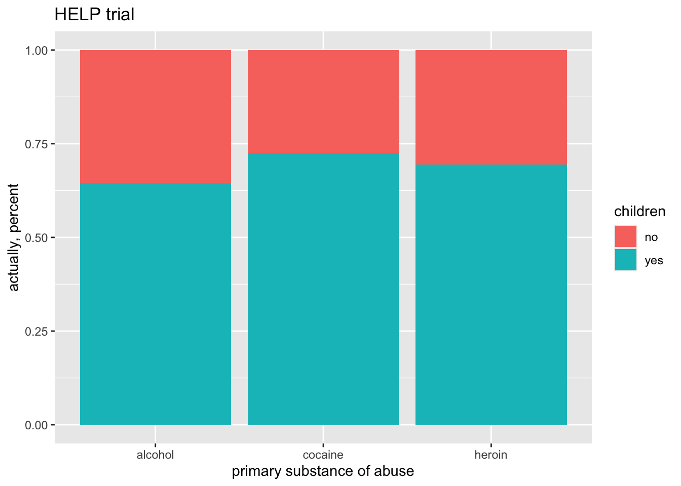
Who are the people in the study?
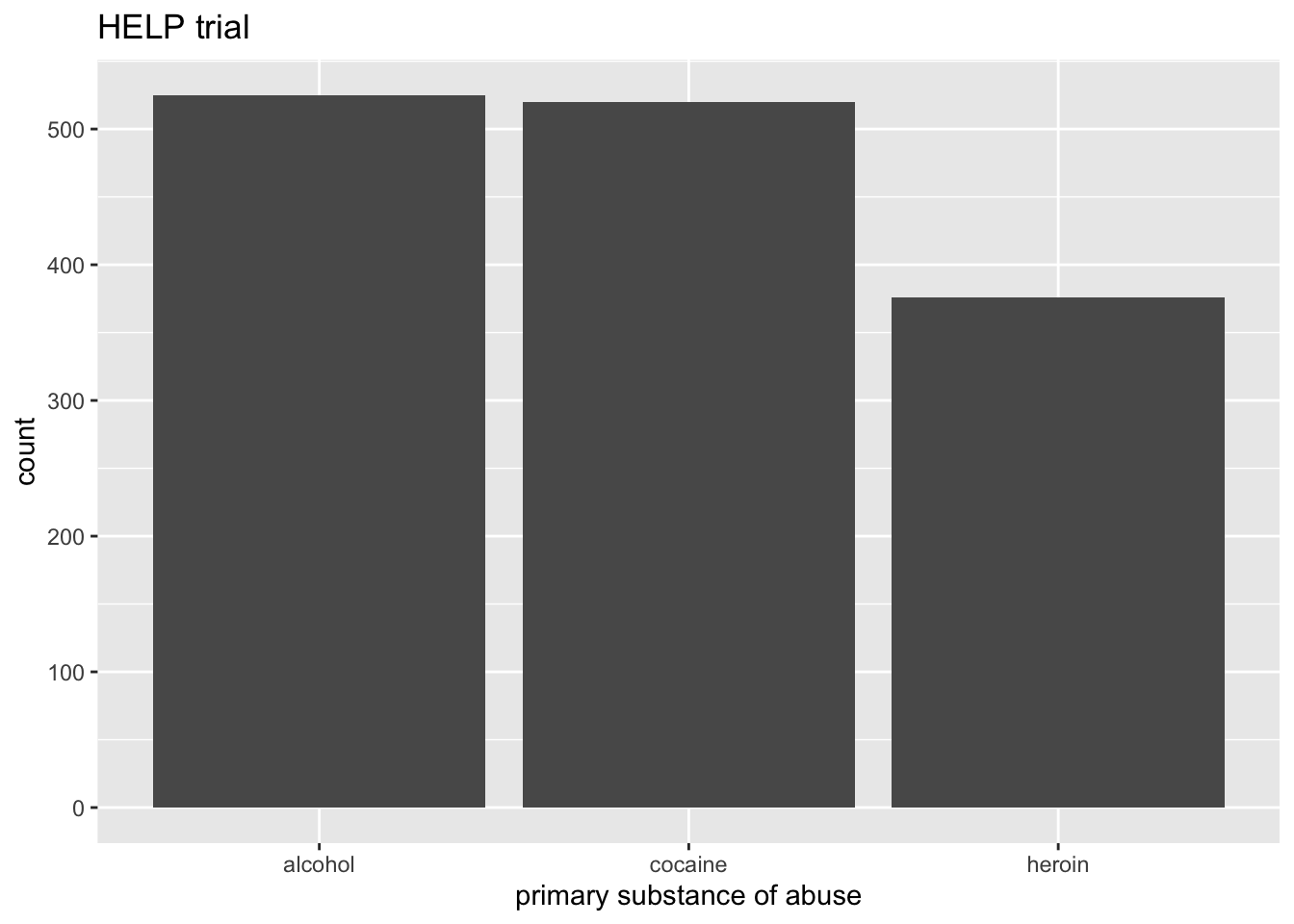
Who are the people in the study?
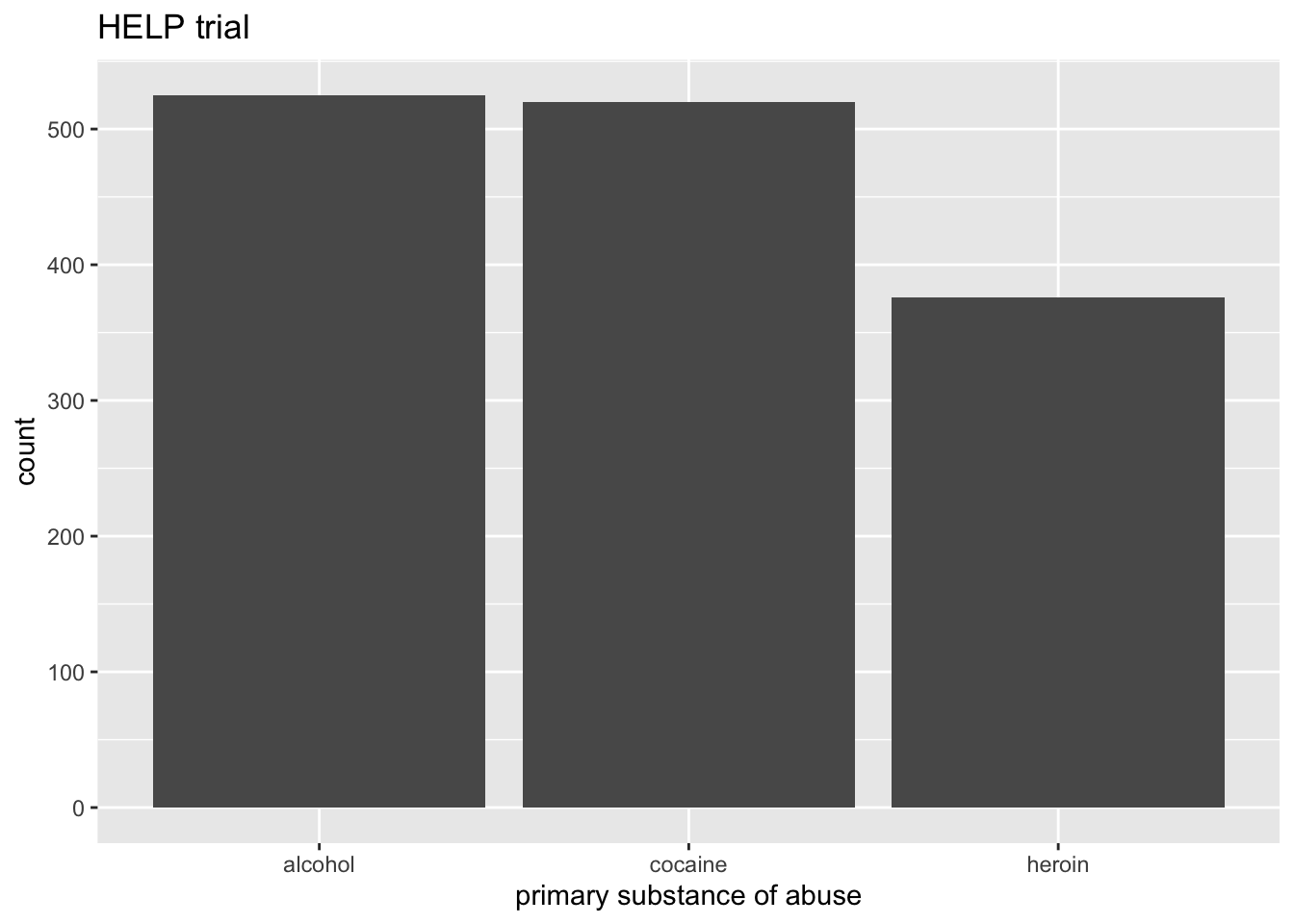
Who are the people in the study?
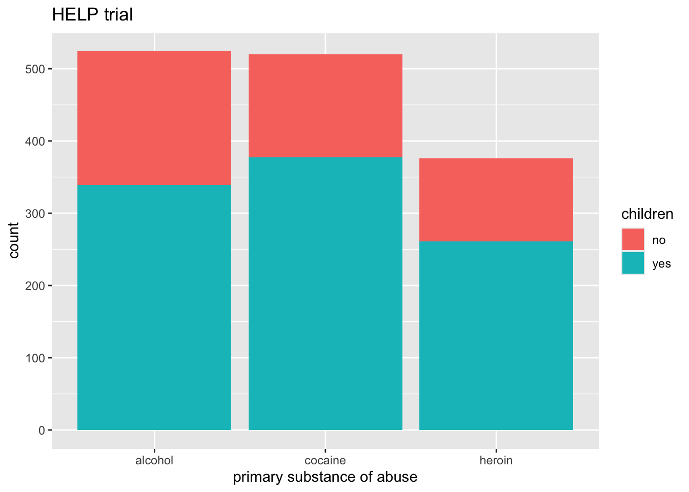
Who are the people in the study?
How old are people in the HELP study?
`stat_bin()` using `bins = 30`. Pick better value `binwidth`.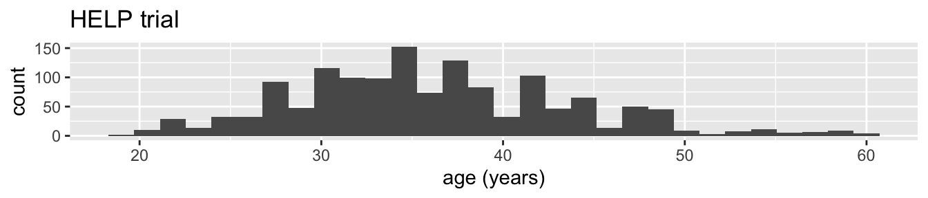
Notice the messages
stat_bin: Histograms are not mapping the raw data but binned data.
stat_bin()performs the data transformation.binwidth: a default binwidth has been selected, but we should really choose our own.
Setting the binwidth manually
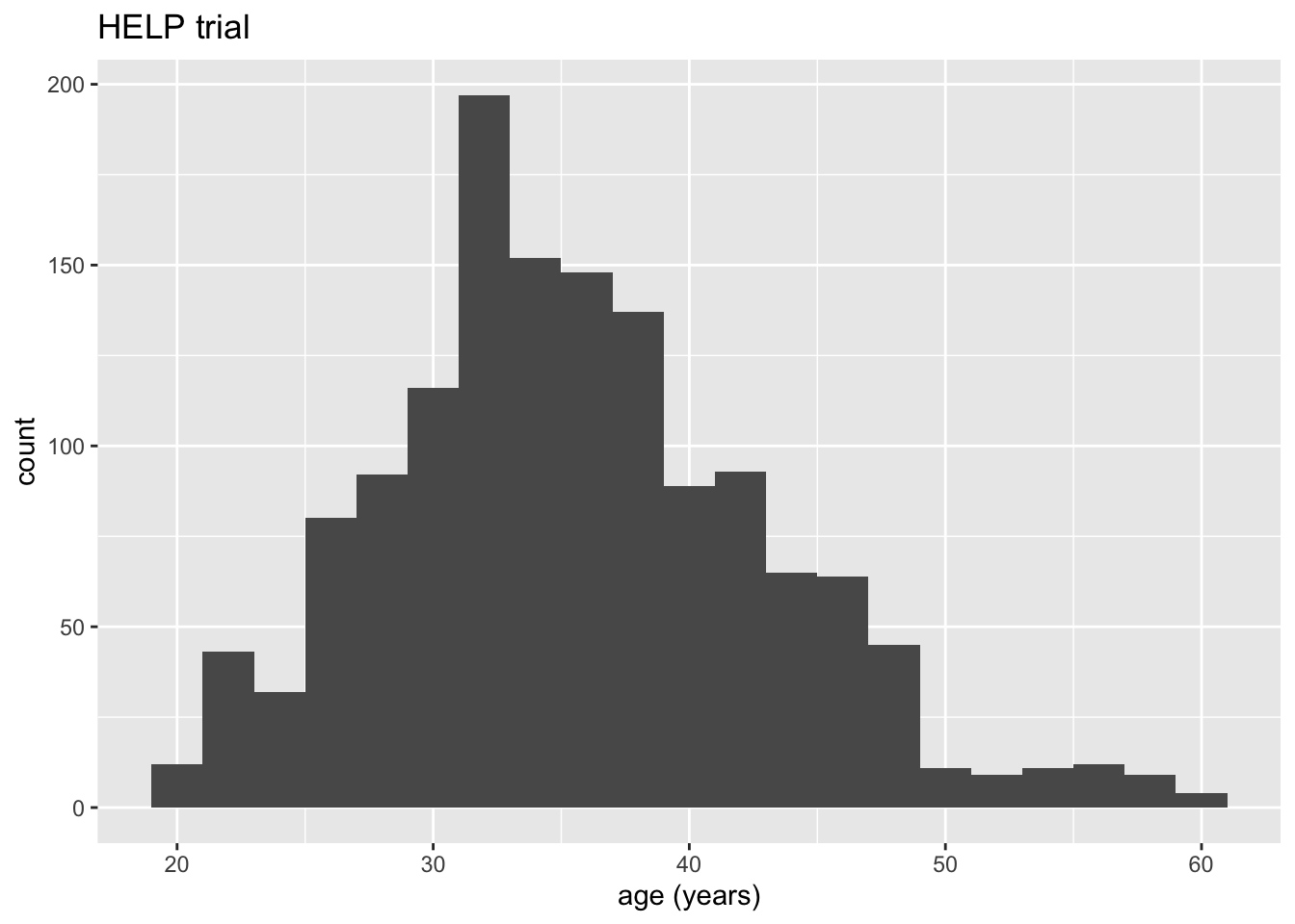
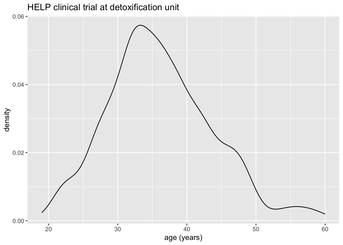
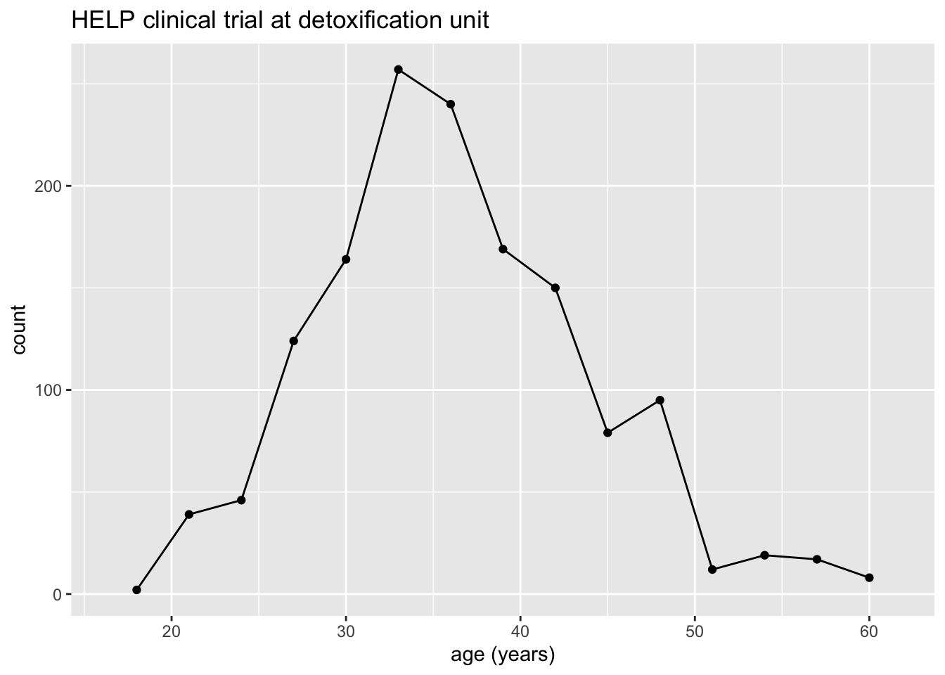
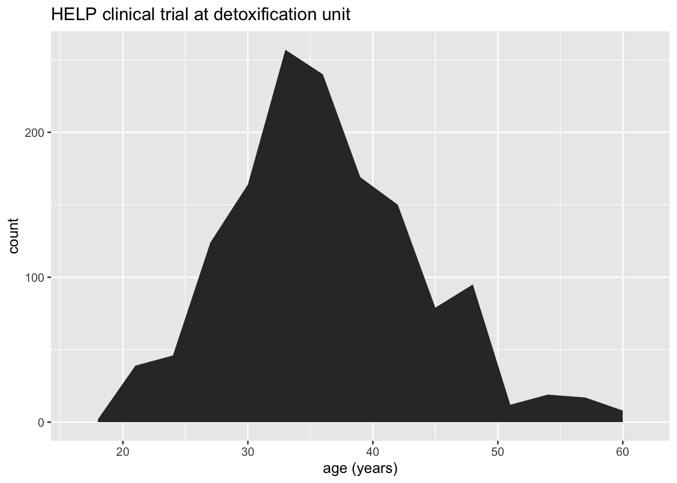
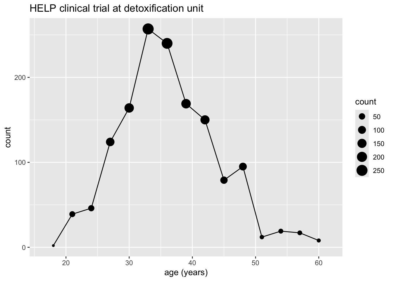
How old are people in the HELP study? – Other geoms
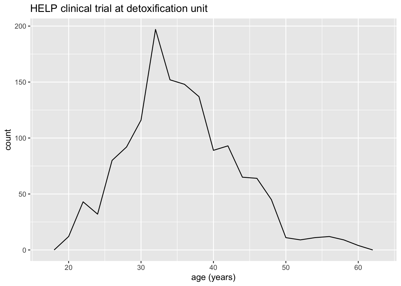
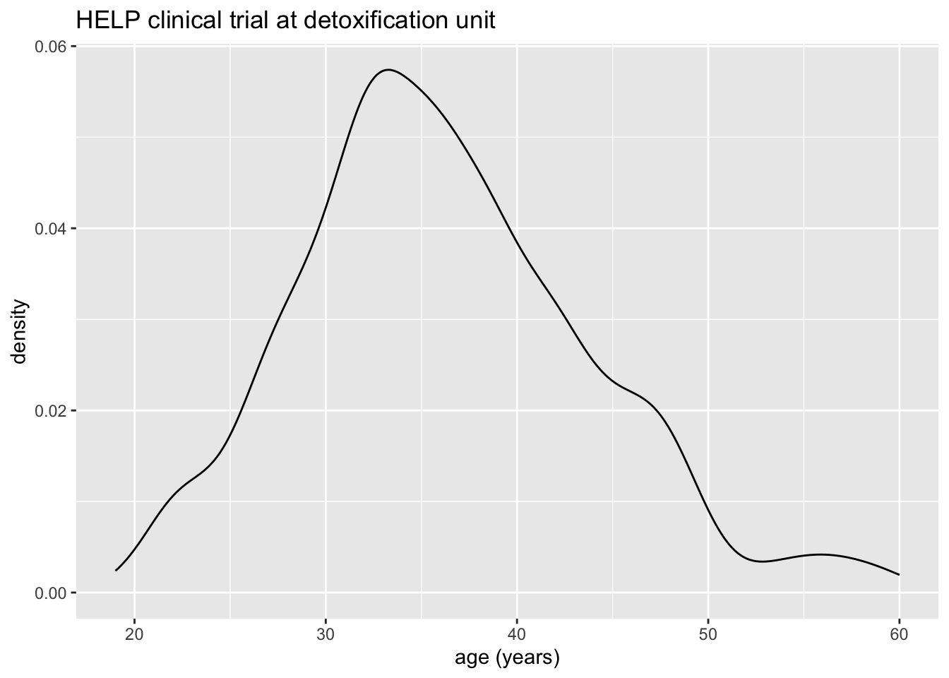
Selecting stat and geom manually
Every geom comes with a default stat
- for simple cases, the stat is
stat_identity()which does nothing - we can mix and match geoms and stats however we like
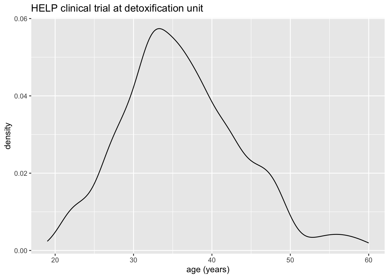
Selecting stat and geom manually
Every stat comes with a default geom, every geom with a default stat
- we can specify stats instead of geom, if we prefer
- we can mix and match geoms and stats however we like
More combinations
More combinations
More combinations
How much drinking? (i1)
HELP_data |>
  ggplot(aes(x = i1)) +
  geom_histogram() +
  labs(title = "HELP clinical trial at detoxification unit")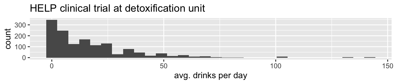
How much drinking? (i1)
HELP_data |>
  ggplot(aes(x = i1)) +
  geom_density() +
  labs(title = "HELP clinical trial at detoxification unit")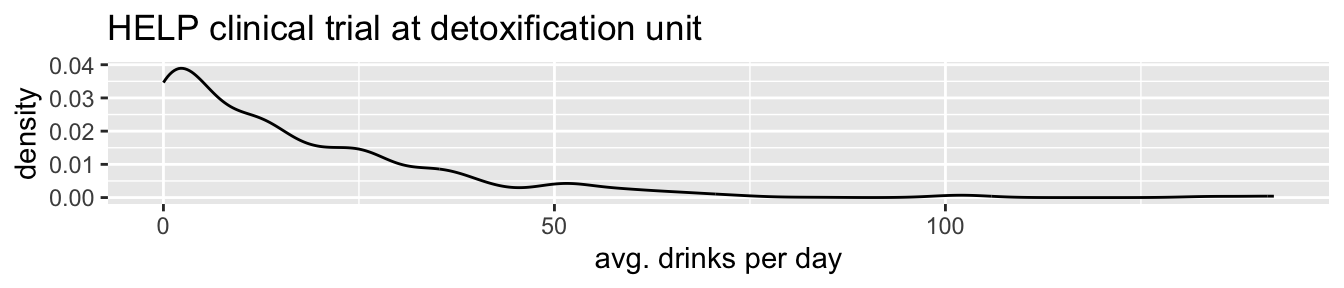
How much drinking? (i1)
HELP_data |>
  ggplot(aes(x = i1)) +
  geom_area(stat = "density") +
  labs(title = "HELP clinical trial at detoxification unit")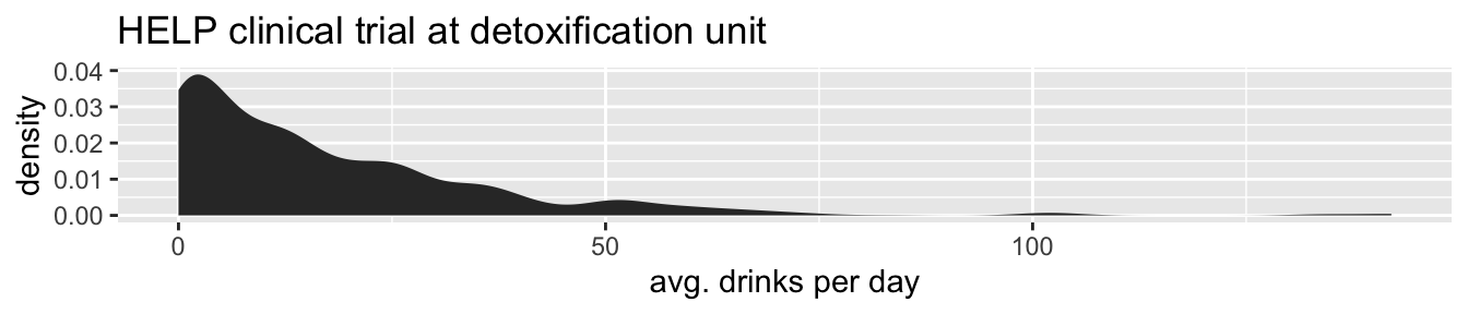
Covariates: Adding in more variables
Using color and linetype:
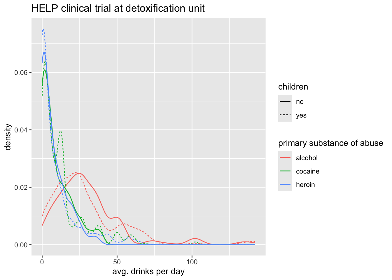
Using color and facets
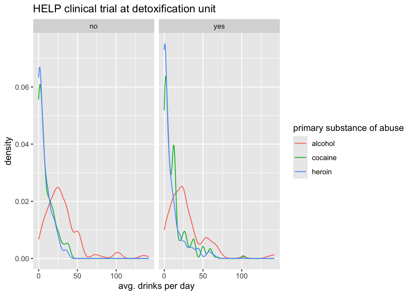
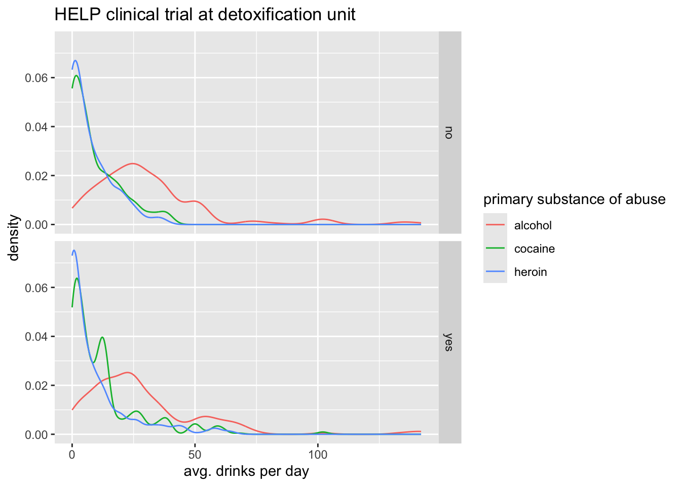
Boxplots
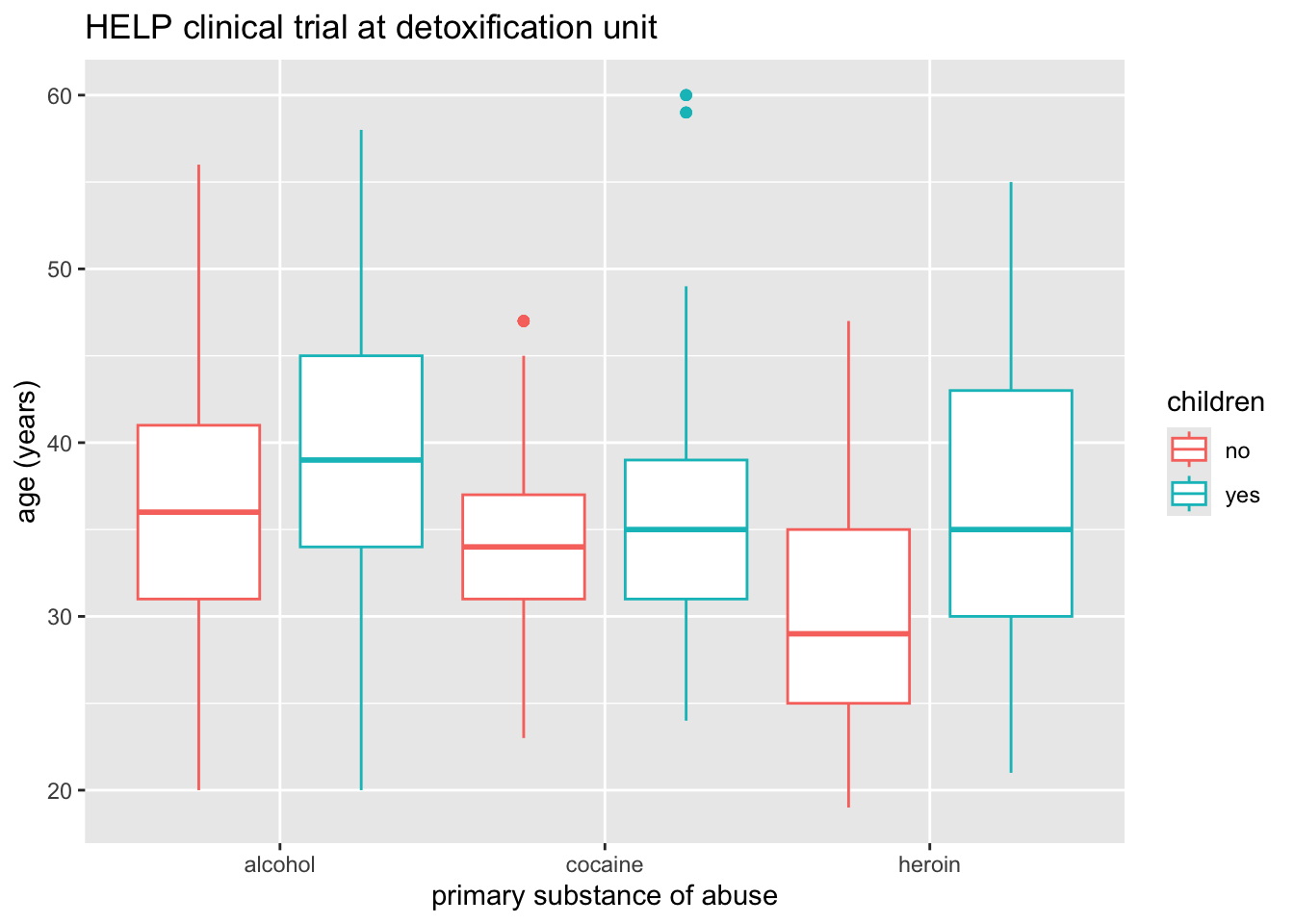
Boxplots use stat_quantile() (five number summary).
The quantitative variable must be y, and there must be an additional x variable.
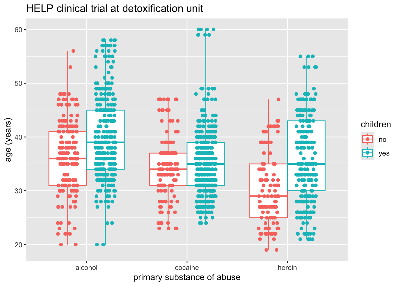
HELP_data |>
  ggplot(aes(x = substance, y = age, color = children)) +
  geom_boxplot() +
  labs(title = "HELP clinical trial at detoxification unit")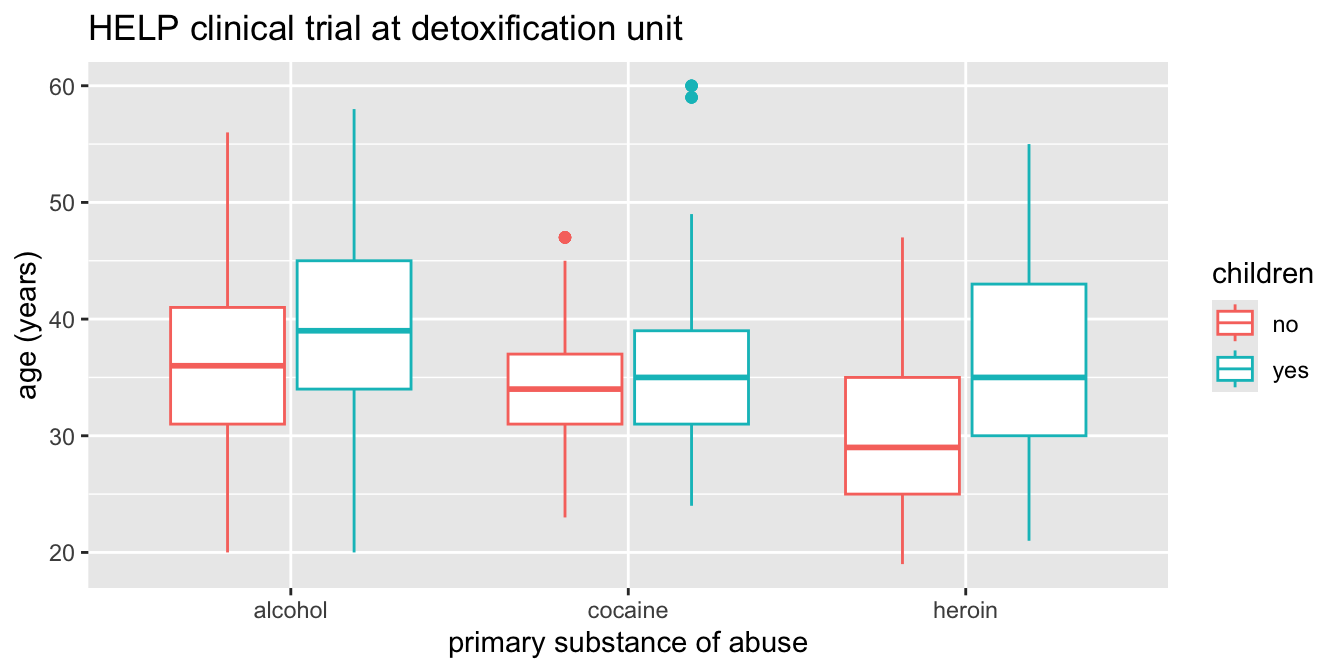
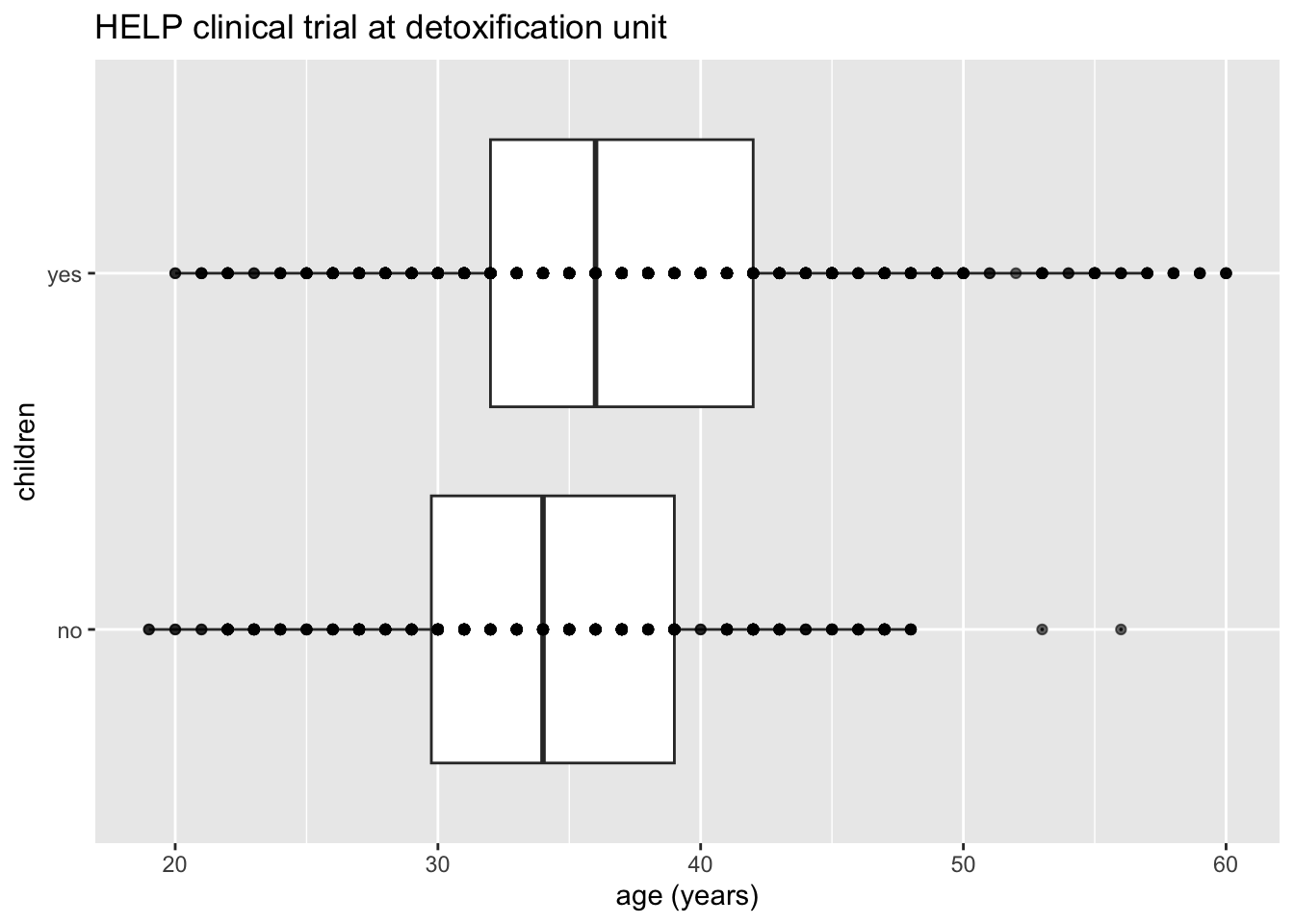
Horizontal boxplots
Horizontal boxplots are obtained by flipping the coordinate system:
coord_flip()may be used with other plots as well to reverse the roles ofxandyon the plot.
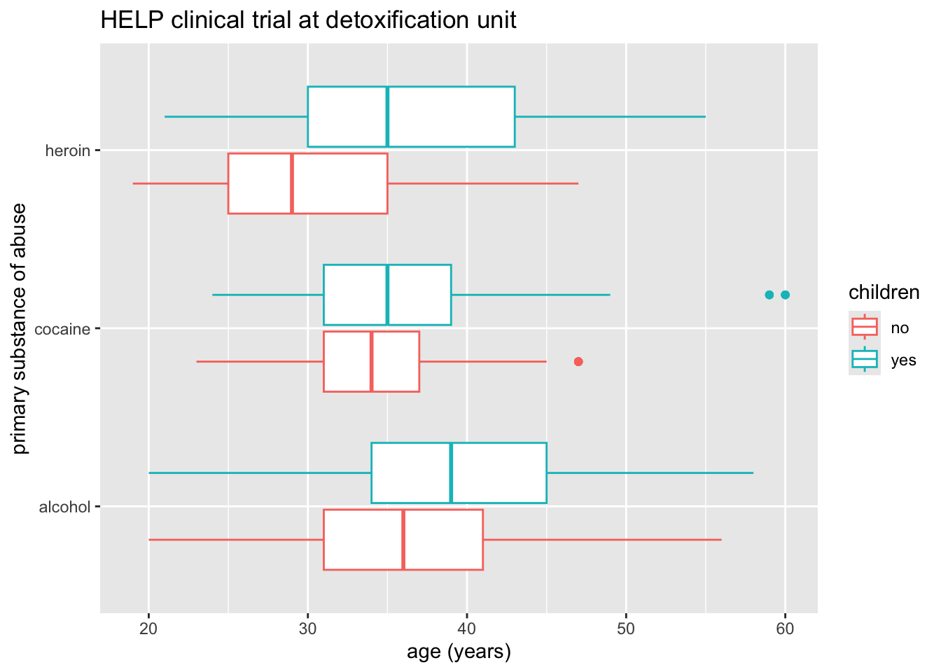
Axes scaling with boxplots
We can scale the continuous axis
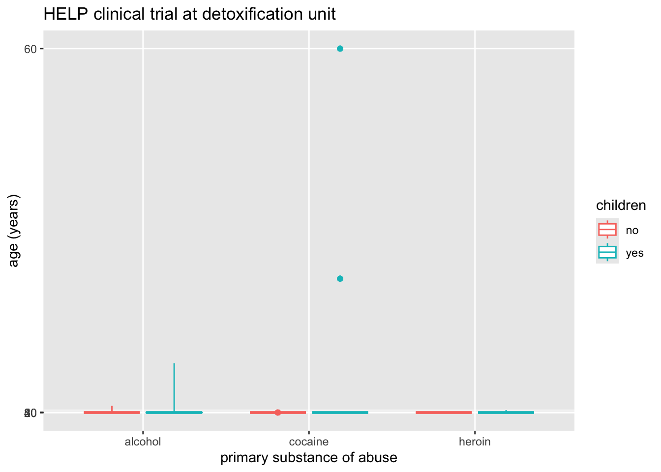
Give me some space
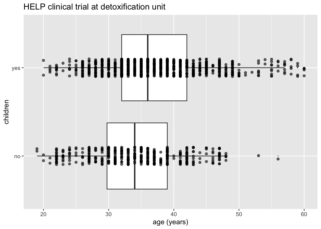
We’ve triggered a new feature: dodge (for dodging things left/right). We can control how much if we set the dodge manually.
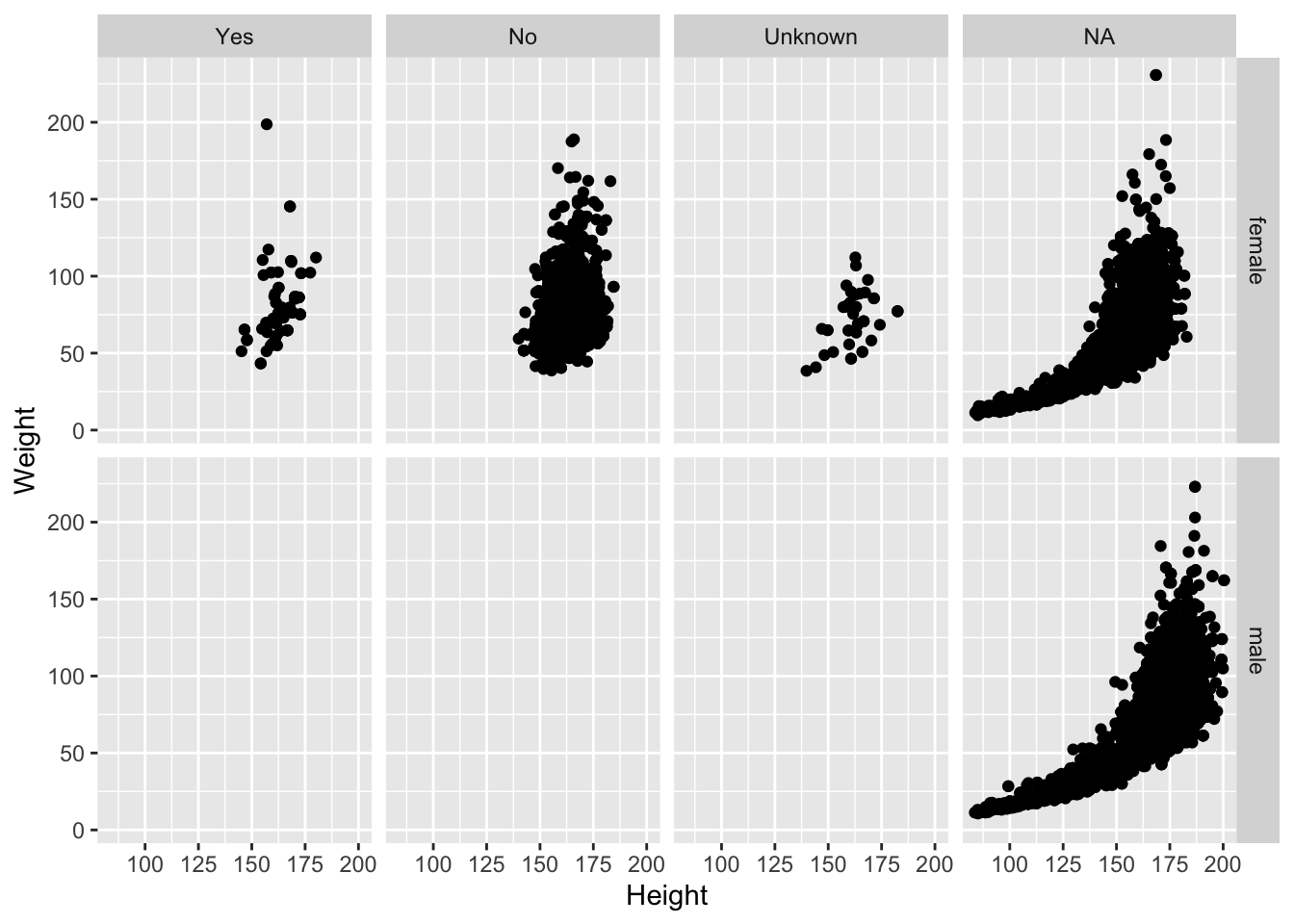
Issues with bigger data
- Although we can see a generally positive association (as we would expect), the overplotting may be hiding information.
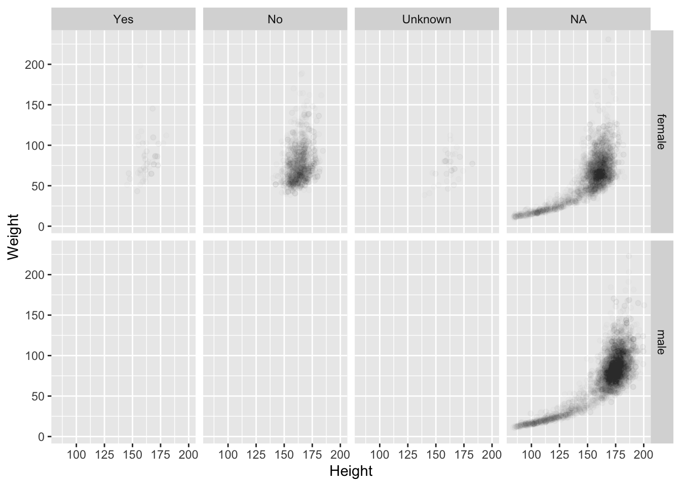
Using alpha (opacity)
One way to deal with overplotting is to set the opacity low.
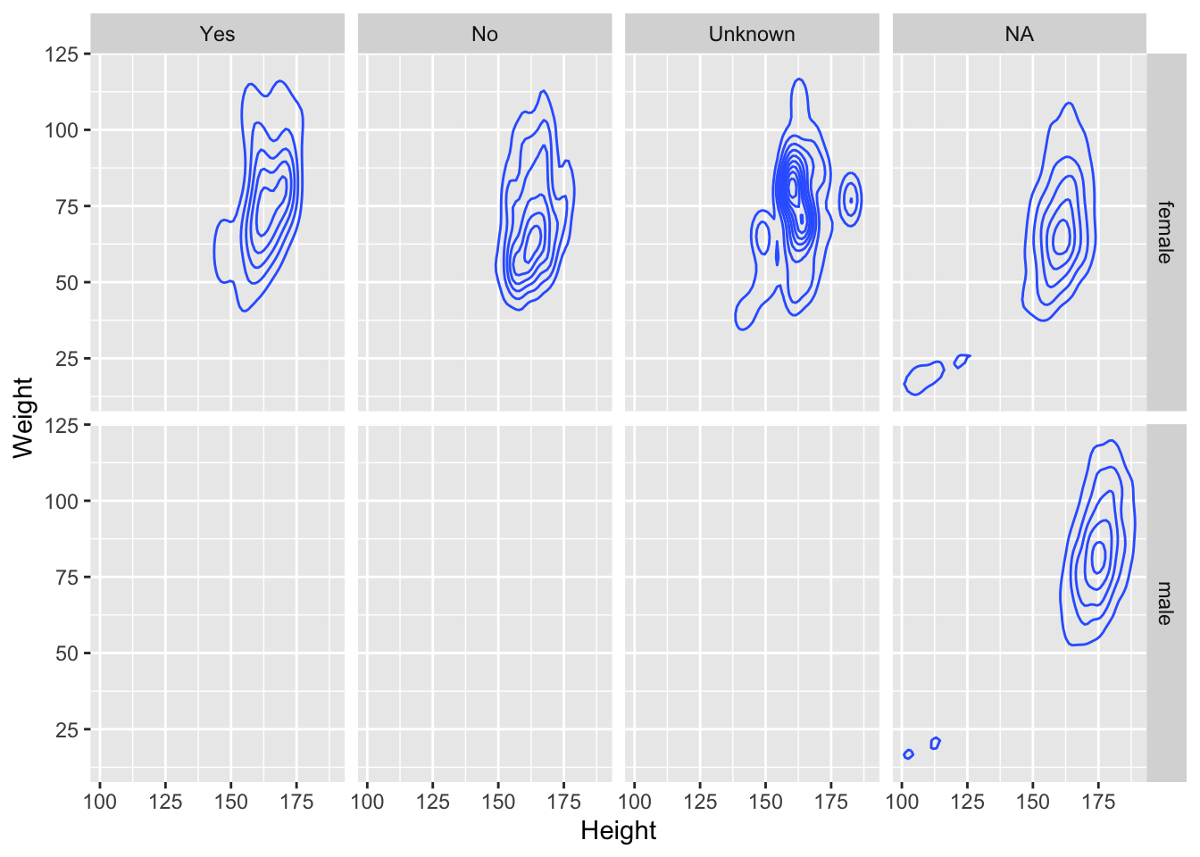
geom_density2d
Alternatively (or simultaneously) we might prefer a different geom altogether.
Multiple layers
Multiple layers
Things I haven’t mentioned (much)
coords (
coord_flip()is good to know about)themes (for customizing appearance)
position (
position_dodge(),position_jitterdodge(),position_stack(), etc.)transforming axes
themes
jitterdodge()
A little bit of everything
ggplot(data = HELP_data, aes(x = substance, y = age, color = children)) +
  geom_boxplot(coef = 10, position = position_dodge(width = 1)) +
  geom_point(
    aes(fill = children),
    alpha = .5,
    position = position_jitterdodge(dodge.width = 1, jitter.width = 0.2)
  ) +
  facet_wrap(~homeless) +
  labs(title = "HELP clinical trial at detoxification unit")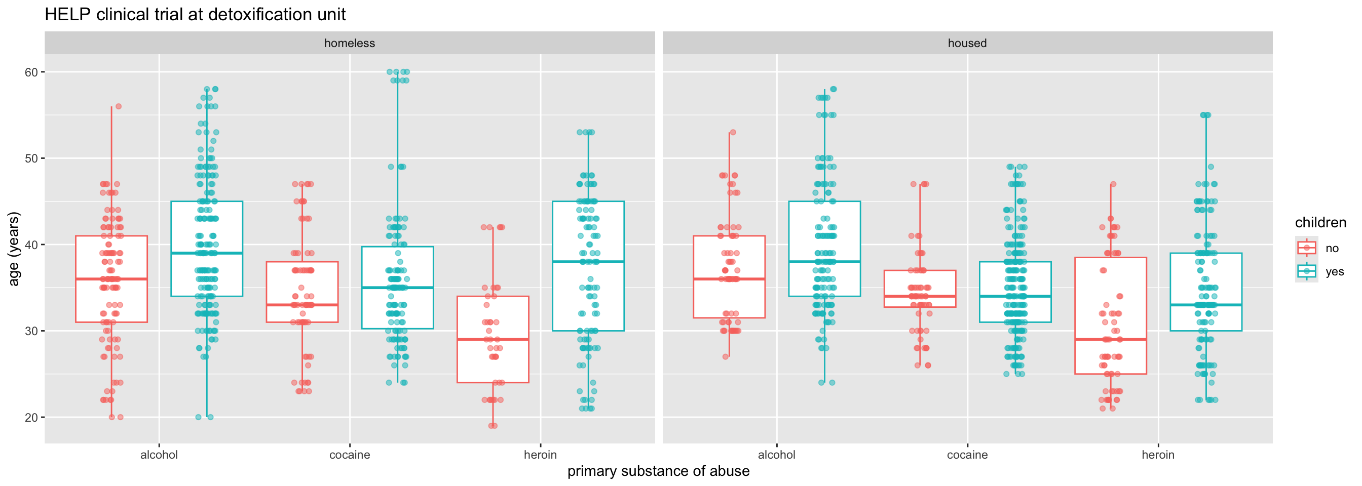
Want to learn more?
R for Data Science by Hadley Wickham and Garrett Grolemund
What’s around the corner?
shiny
interactive graphics / modeling
https://shiny.posit.co/
plotly
Plotlyis an R package for creating interactive web-based graphs via plotly’s JavaScript graphing library,plotly.js. The plotly R libary contains theggplotlyfunction , which will convert ggplot2 figures into a Plotly object. Furthermore, you have the option of manipulating the Plotly object with thestylefunction.
- https://plot.ly/ggplot2/getting-started/
gganimate
Footnotes
image credit: Better Data Visualization by Schwabish↩︎
Probably the most prominent cue is position.↩︎
Probably the most prominent cue is length.↩︎
Angle, color, and area all seem to be enconding the same information.↩︎
Direction. Maybe length.↩︎
Shape is super important here, but we also see position.↩︎
Shade.↩︎
Color.↩︎